2 weeks
UX Designer
UX Researcher
N/A
Augmented Reality is the future.
The purpose of this project was to gain a better understanding at the new design language and interaction for Apple’s new VisionOS. Augmented Reality has been a huge interest of mine, and even though the space is still in its infancy, I decided to get comfortable designing an app that takes advantage of spatial computing.
A big stand out from Apple’s demonstration of it VisionOS software was the interactions users would have with 3D imagery and assets. The problem is that there are very few platforms that share and distribute 3D content, and even fewer that allow you to explore and view 3D content with a Augmented Reality/Virtual Reality device. This is where FontAwesome comes in. A popular platform, famous for distributing 2D content, would be the perfect brand to establish a VisionOS app early in development.
Before stepping into the world of Augmented Reality, I needed to see how FontAwesome would translate well with VisionOS. As an early piece of software, it was important to follow the guidelines laid out by Apple, and try to fit the FontAwesome experience within those guidelines.
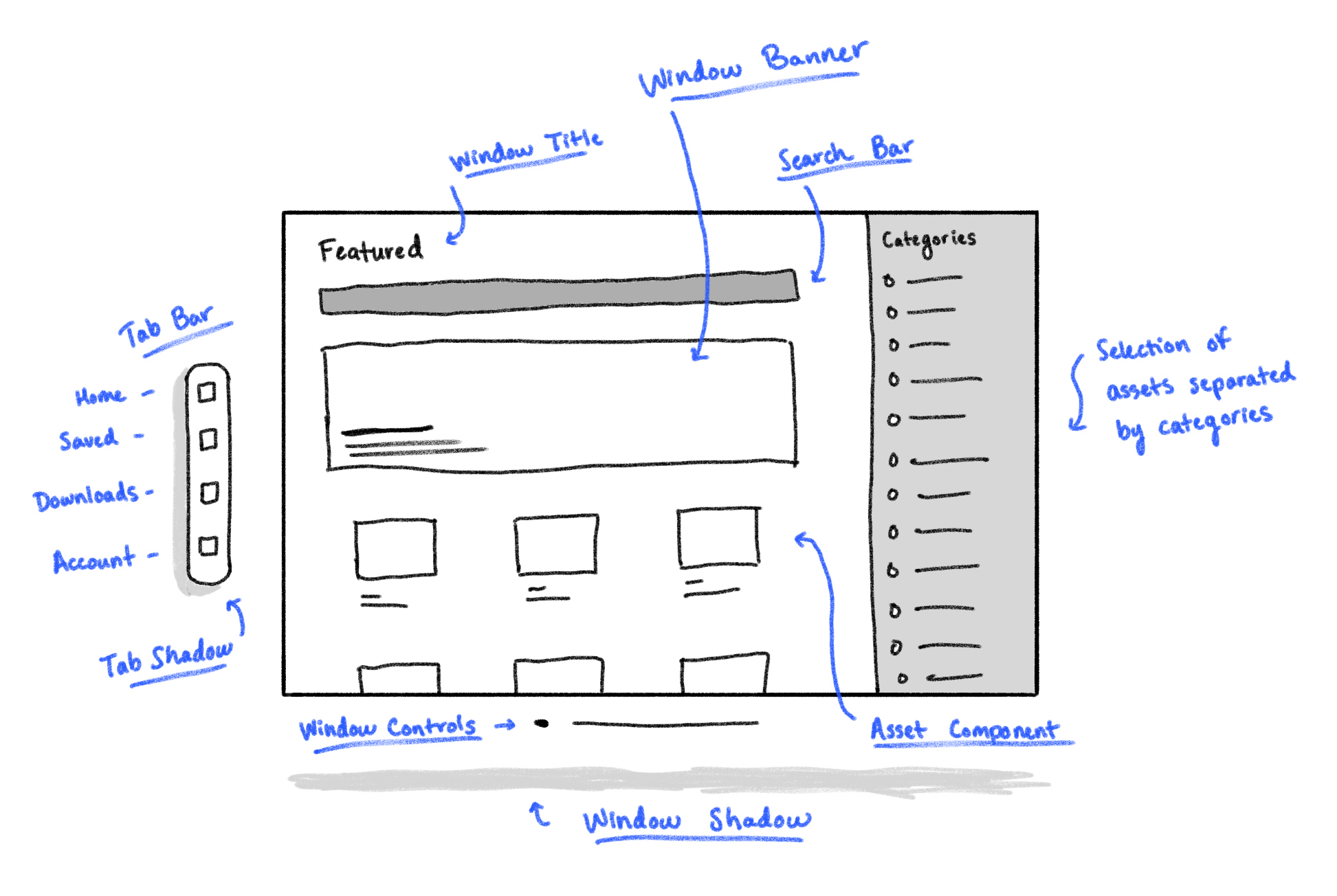
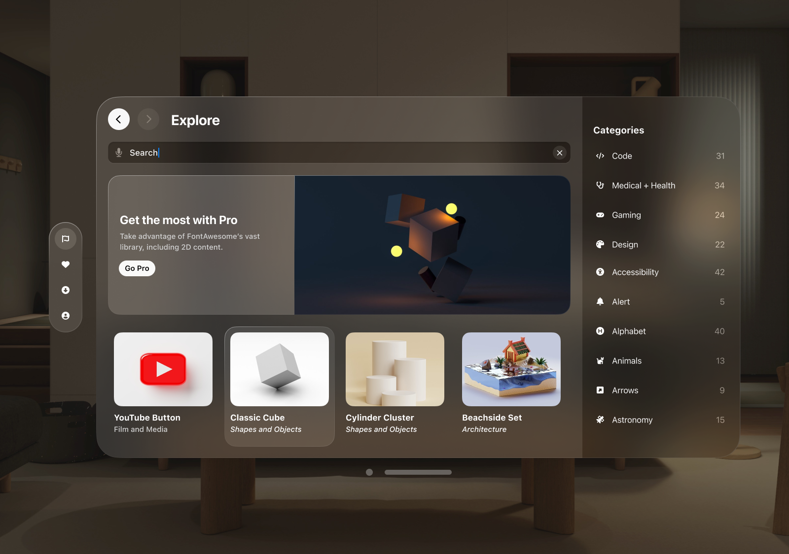
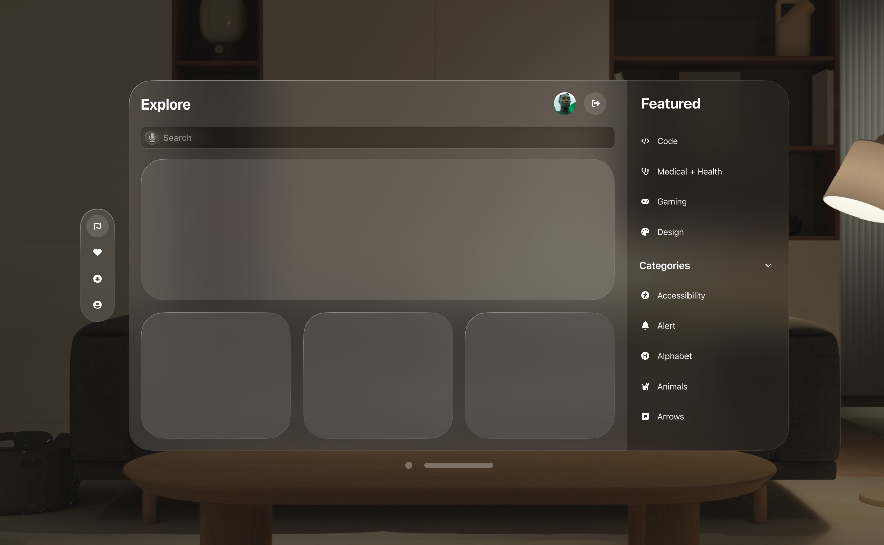
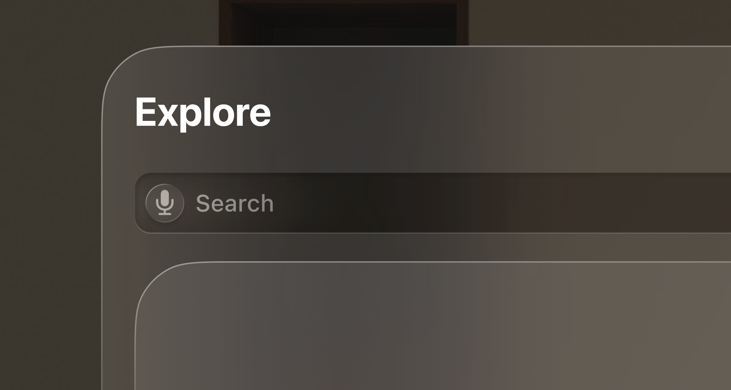
I started with a blank canvas, using elements that were familiar in VisionOS, with the layout seen in FontAwesome. It’s a simple flow of information, the title of the screen, a search bar, followed by a pagination of featured assets. In VisionOS, Apple recommends to extend content horizontally, not vertically. This puts less strain on the user’s viewing angle, and allows pages to flow naturally while navigating between them.
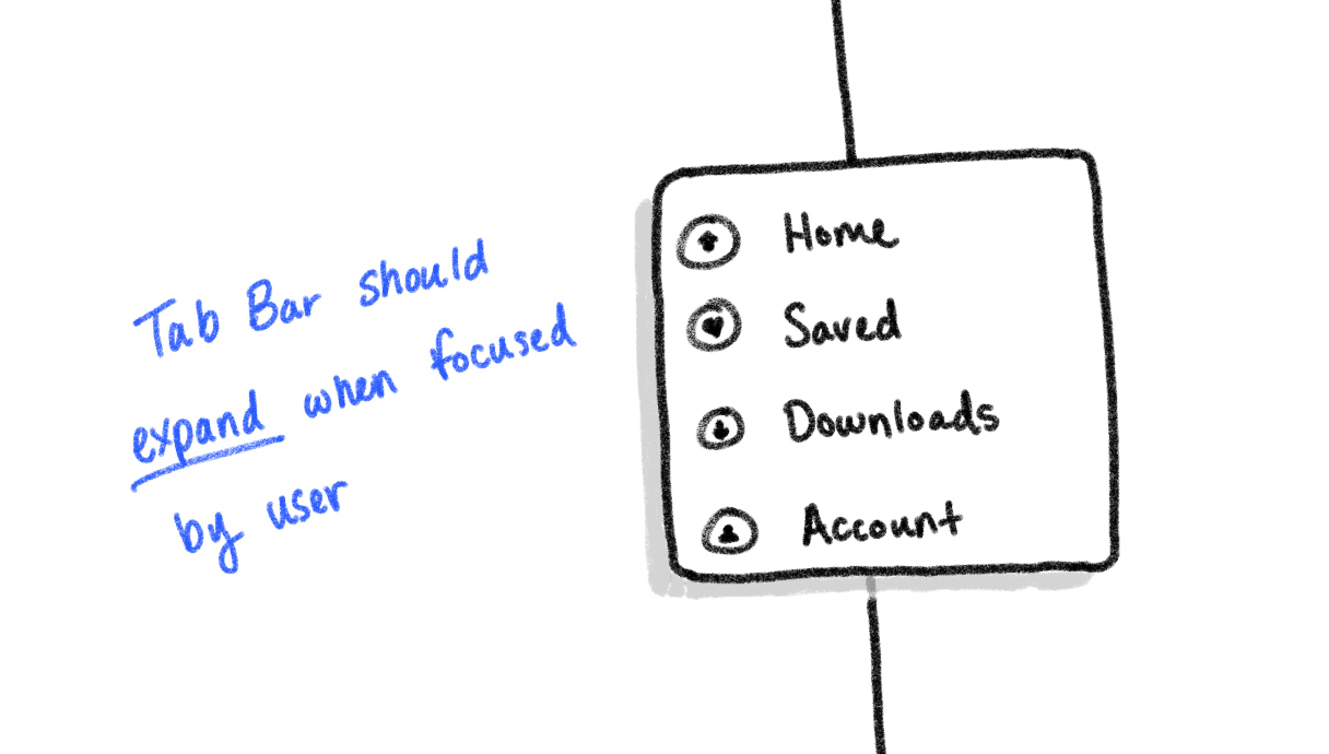
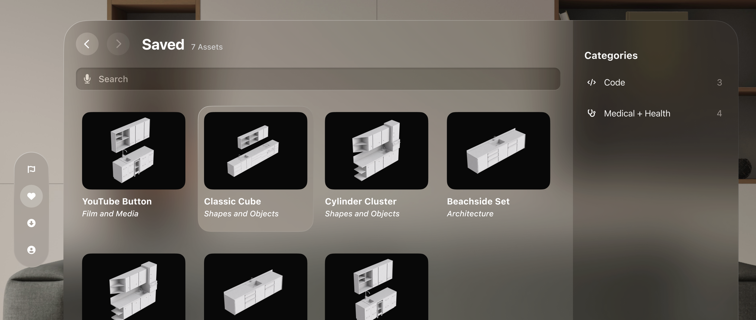
As for the tab bar, Apple recommends between 2 to 6 icons as to not overwhelm the user with options. This is meant to act as the tab bar traditionally seen at the bottom of iOS app. So, the tab bar would naturally fit that model. For the purposes of this project, exploration and inspiration are at the heart of this application. I want users to quickly shuffle from exploring, to viewing previously saved assets, download management for assets saved on the device, and an account page.
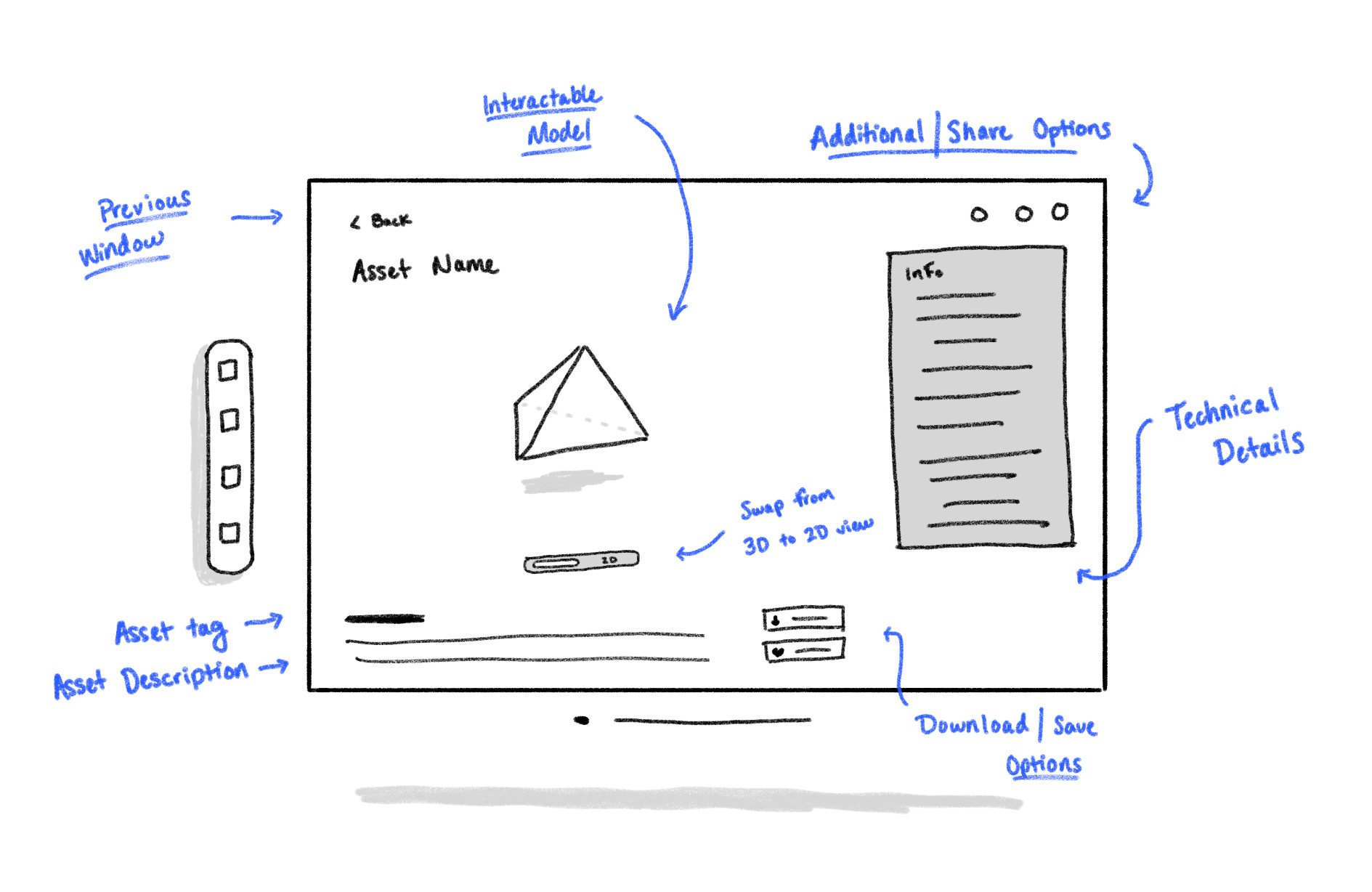
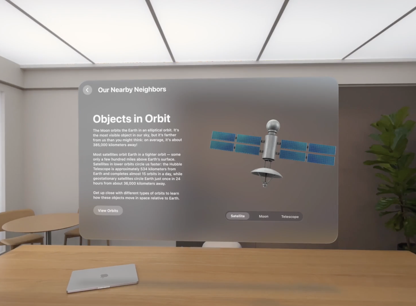
The next segment I tackled was the asset page, giving users a more detailed look on their selection. This is where there was more of an opportunity to deviate from FontAwesome’s layout, since their asset page is regulated to a pop-up modal. But seeing as this was a 3D asset application, in an Augmented Reality device, the opportunity to take advantage of that was too good to pass up. Not only would this serve asa way for users to interact with assets before using them, but it also lend itself nicely to showcase similar assets, or even display assets that Pro members benefit from.
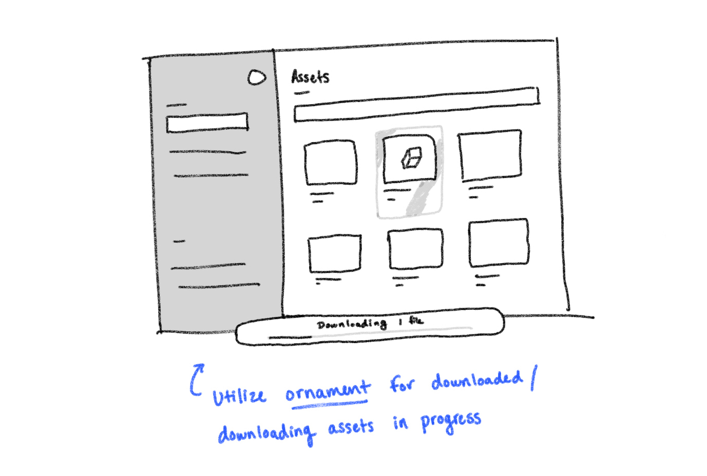
Ornaments were also components that could have utility in this application, displaying actionable sub-information. However, the purpose of this component is to showcase information or actions that the user can take outside of that page. There was no clear purpose of utilizing an ornament that only served each page independently. However, downloads have that utility opportunity, making use of showing download speed, an ETA, and a quick glance at paused downloads or number of downloads. This fits the purpose of an ornament while also giving users useful insight during their exploration.
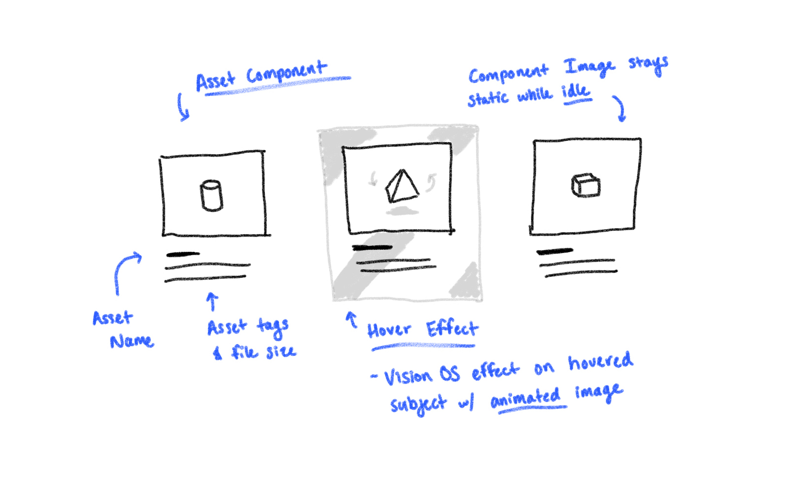
One thing that I had to keep in mind while ideating was the spacing afforded to me by VisionOS. There are a lot of subtle effect that are at the core of interacting with the device. One of them being the hover effect that acted as a cursor. For actionable components, padding was necessary to meet these guidelines.
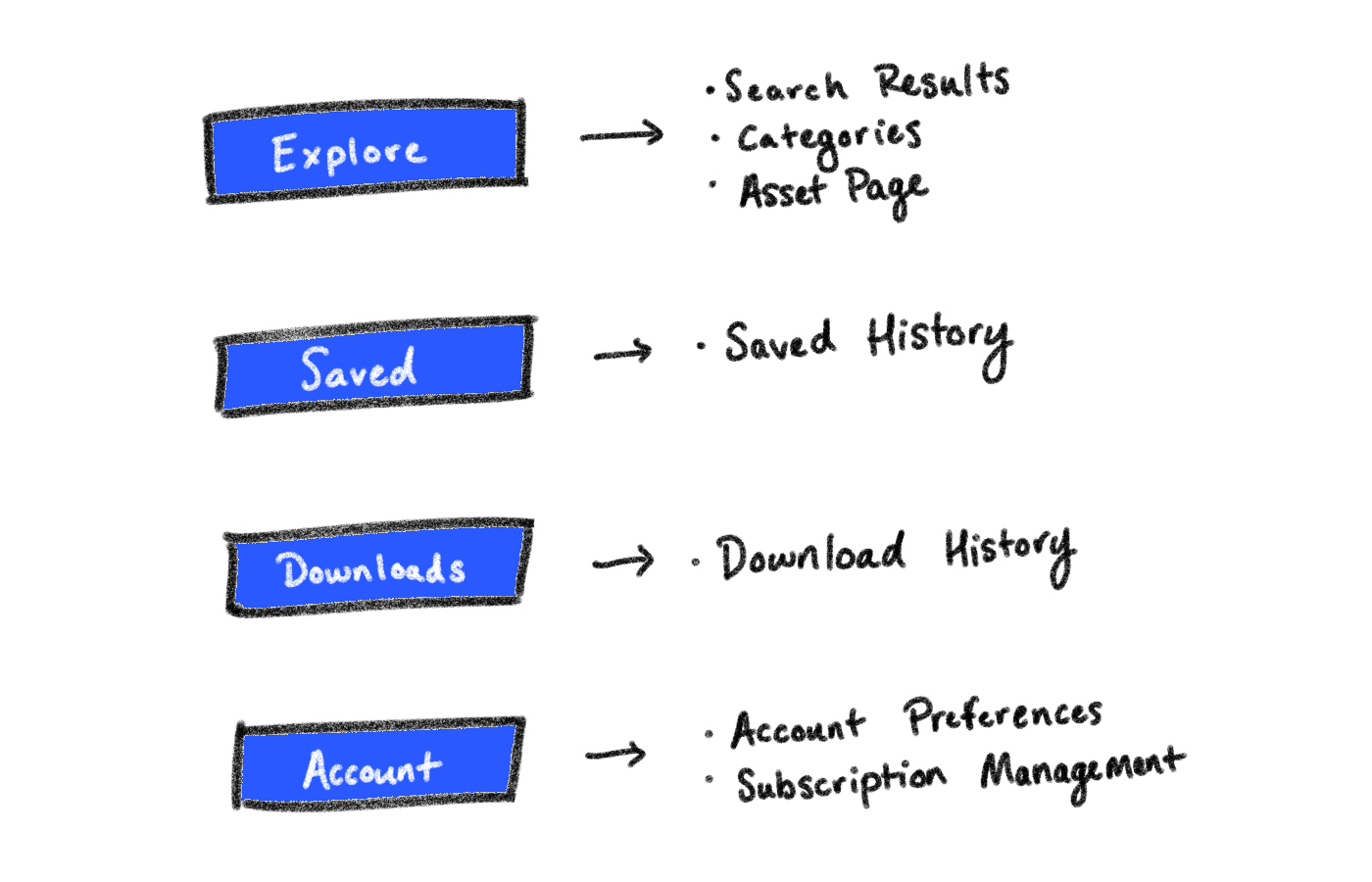
With a clear understanding of the application's purpose and Apple's recommended layout principles, I turned my attention to page navigation. The home page served as the focal point for exploring assets, featuring a categories section leading to asset-specific pages. The search bar directed users to inquiry results, while the asset page marked the endpoint, offering options to save, download, or learn more about assets before returning to exploration.
With a defined project scope and application flow in mind, I began crafting high-fidelity wireframes, starting with the home page. VisionOS's unique 'Glass Material' design, characterized by specular highlights and shadows for adaptable lighting, presented a challenge in mimicking within the application, given the need for seamless adaptation to diverse user environments.
While FontAwesome uses a custom font family, I aimed to maintain consistency with their visual language, particularly in the early stages of the platform's development. To distinguish title text from body text when paired, I initially considered italicizing the body text, but this proved insufficient. Instead, I opted for a lighter font weight and adjusted the body text color.
Certain interactions also need to have a clear understanding of purpose. The way VisionOS does this is by having strong contrast for input fields, sharing the same glass material while giving it a tactile look. Speaking of input fields, VisionOS does have a keyboard interface to type, but speech to text is quicker, and puts less work on the user.
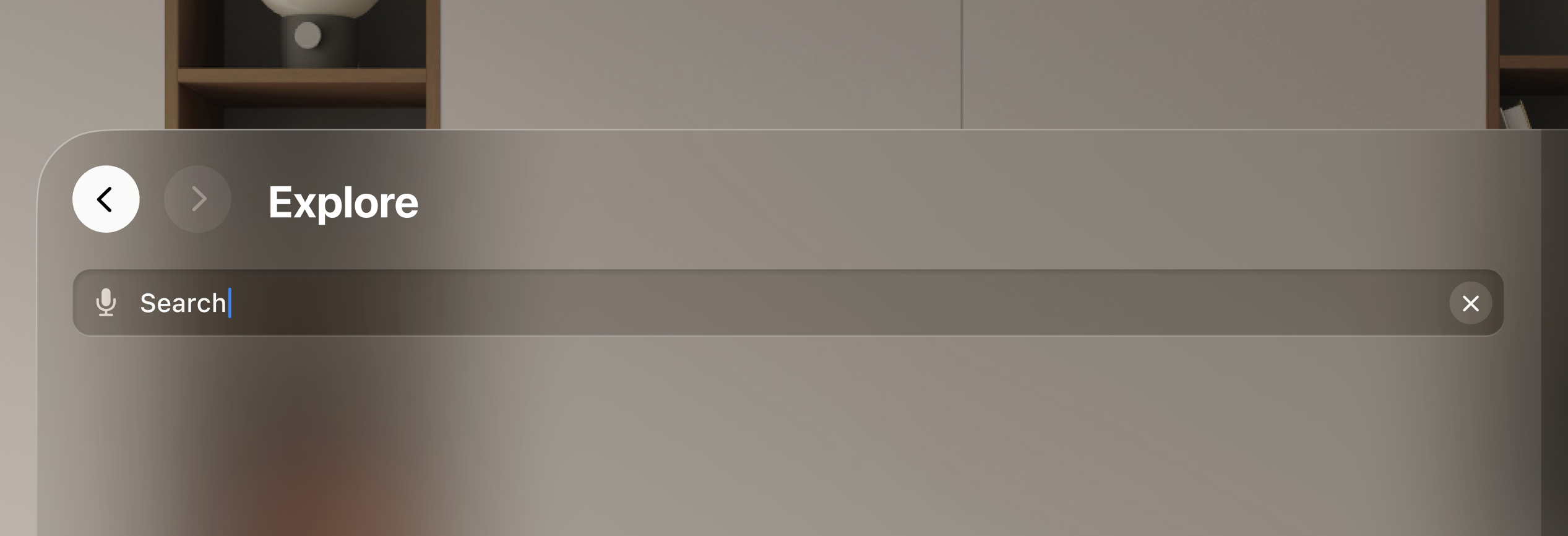
Although navigating through the application would be fairly simple, I felt that having a familiar navigation bar would make exploration more linear for users. To accommodate that, back and forward buttons would allow the user to navigate from their search history. The button themselves would also provide some feedback, having a more pronounced opacity when intractable, and being slightly more obscure when the option is disabled. On top of that, and title of the page would help understand where the user is, while also including secondary information.
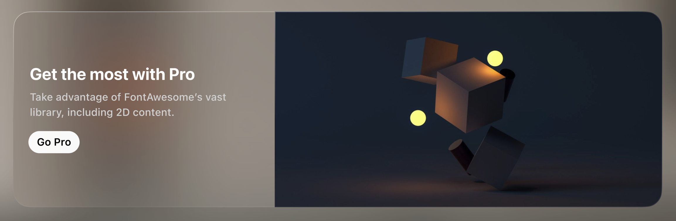
Following my initial layout concept, I opted to integrate a homepage banner to promote the application, serving various purposes like subscriber acquisition and content awareness. To ensure alignment with VisionOS's aesthetics, I maintained consistency with the 'Glass Material' visual language, avoiding opaque backgrounds. I introduced a segmented element, subtly highlighted to maintain visual coherence while effectively drawing attention to the banner.
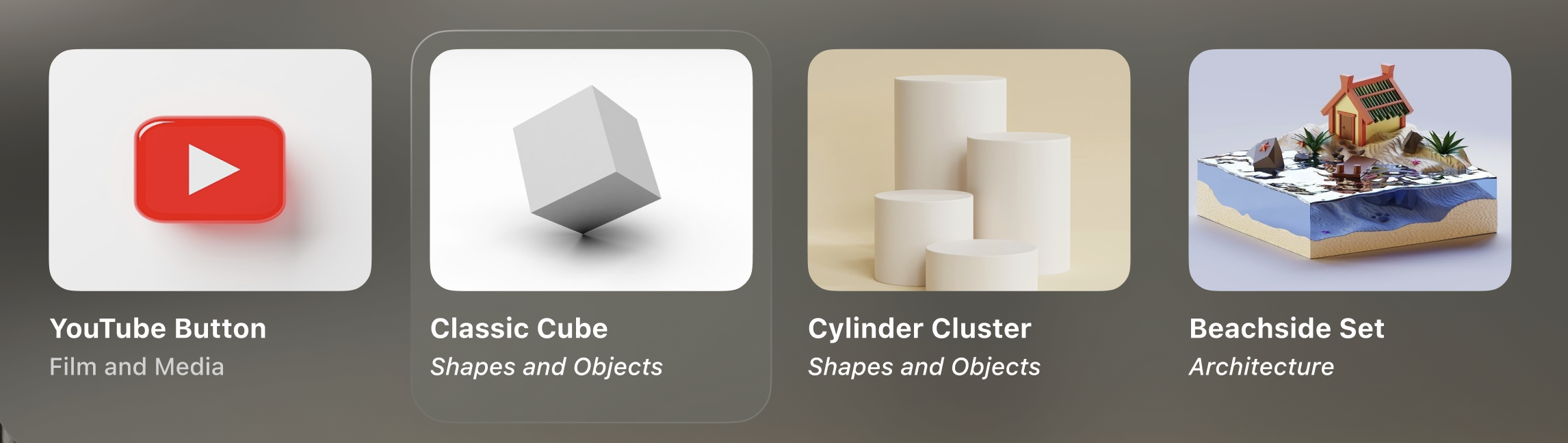
Next, I tackled the asset component, the core of user exploration. Finding the right balance was challenging; initially, I aimed to maximize components but realized it compromised asset detail and user decision-making. To ensure consistency in typography and provide users with valuable information, I opted for a modest size that effectively communicated the asset's value.
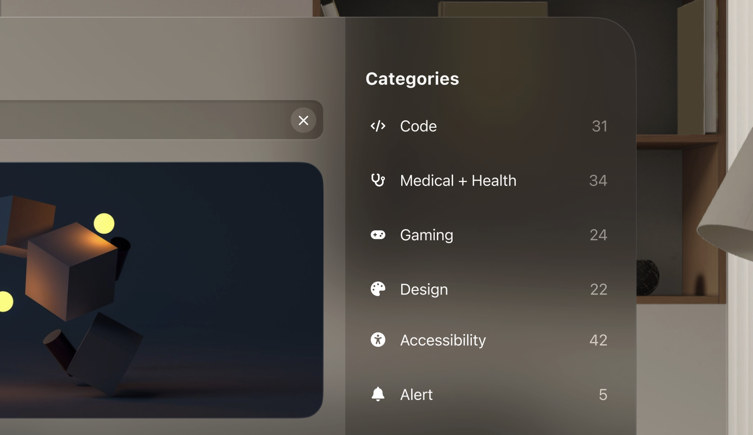
And lastly, the categories section was a bit easier to deal with since it shared a lot of similarities with its iOS counterpart. The only decision I made here was to have the background possess a more darker shade then the rest of the components. This was intentional, setting itself apart from the main flow of information. Including a number count didn’t come later into the project, but it was a decision I made after looking through FontAwesome’s webpage, where that detail helps users make a decision or narrow down their search.
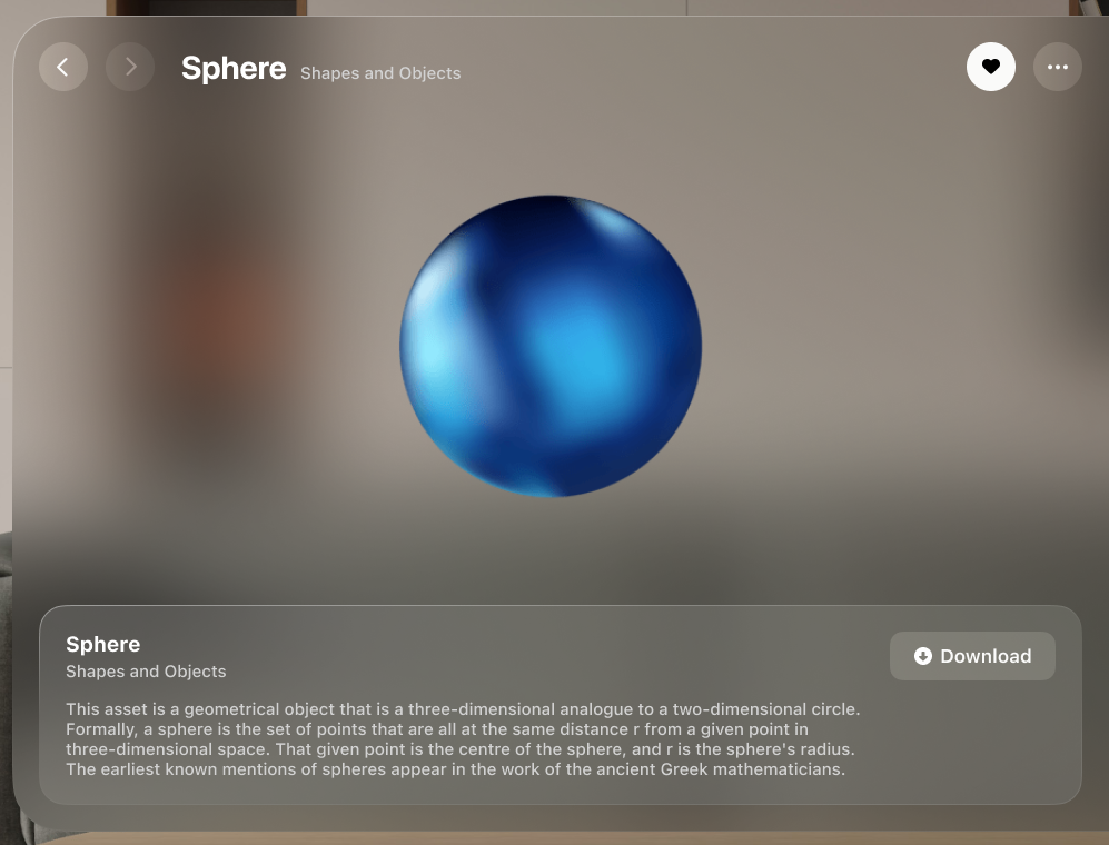
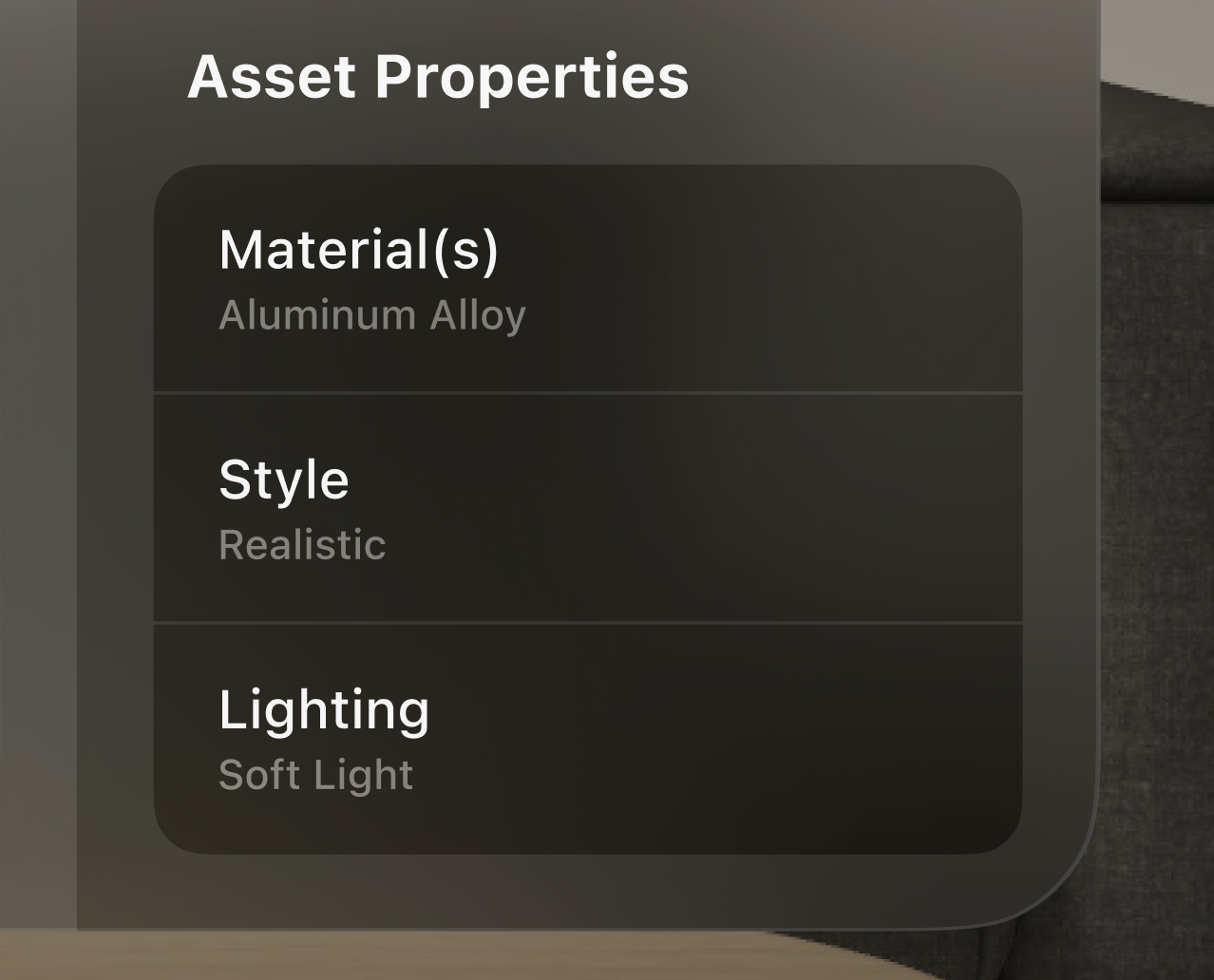
When I was starting this project, all I could picture was presenting assets in a powerful way, in an OS that could take advantage of that experience. The only way to do this is to have the asset take most of the space and include any key details in the surrounding area. I still decided to leave the side bar as a section to display any technical details. This accomplished two things: One was that it minimizes the amount of white space on the page and having to stretch out any text through the whole window width; And two, Apple recommends extending content horizontally, rather than vertically, which can be a very strenuous viewing experience.
Giving some space to add some context to the asset was important. Although some content might seem obvious and don’t require any context, the platform has to accommodate the instances where some more information on the asset is part of the decision making for users, especially when it comes to more intricate and complex assets. I made sure to separate the identifying information and the context information. This plays nicely with the glass material component I had made earlier in the other page, and including a call to action button that has a brighter blur for a highlighted effect.
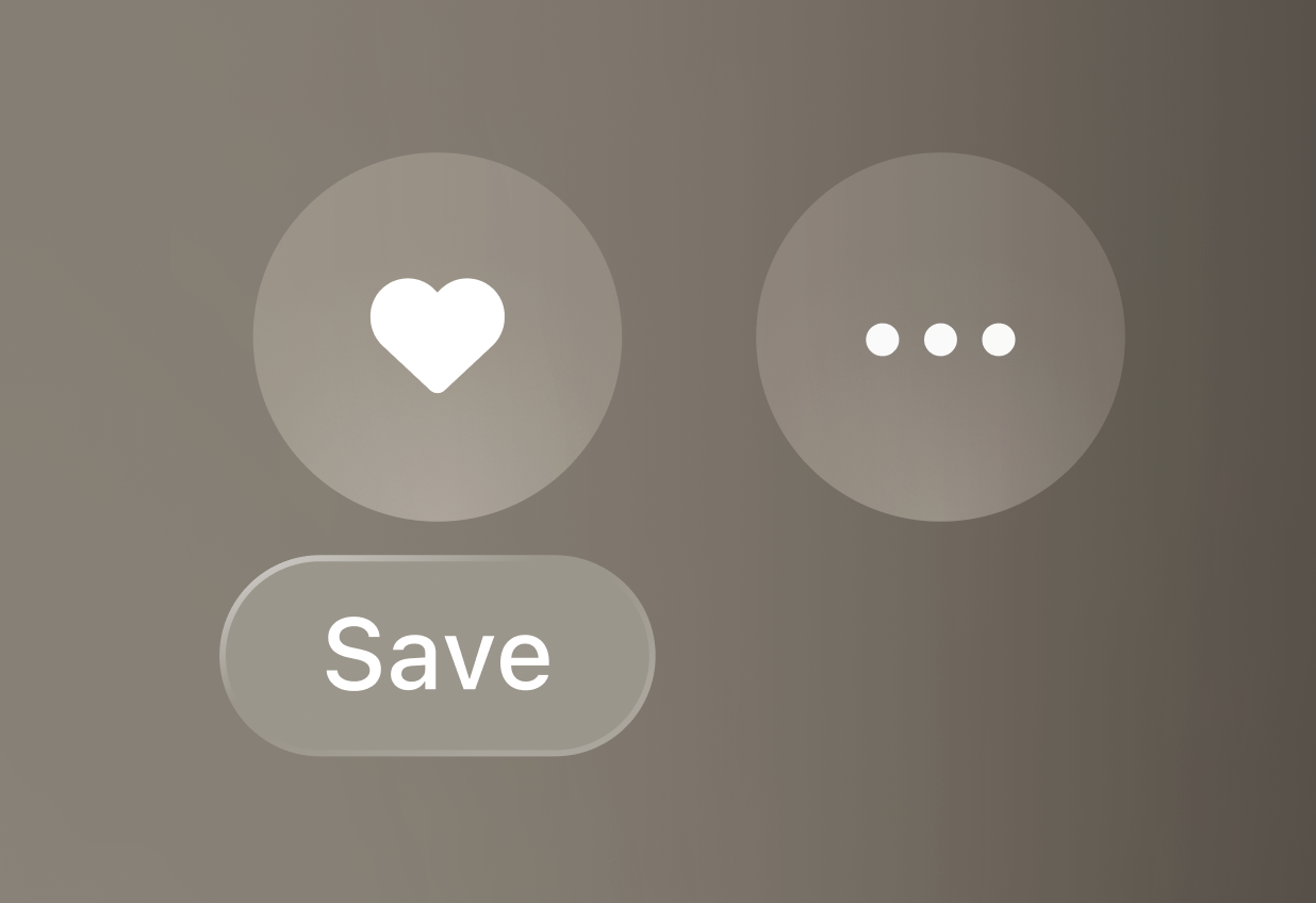
Originally, the ‘Saved’ and ‘More’ options shared a home with the download button. However, this part of the component felt a bit busy with all those buttons. ‘Download’ was more of a definitive action than a secondary action, so having a them together seemed unintuitive. Rather than bundling them all together, I decided to move them to a more natural position, and somewhere that’s more familiar to iOS.
The Saved and Download sections of the application shared a lot of visual similarities, at least originally. I was under the impression that having a familiar viewing experience throughout the application was the most optimal decision for the sake of fluid navigation. But the more I looked at it, the more I felt there was an opportunity here. When users look through their search results and saved assets, they want to seem through options. But when a user makes the active decision to download an asset, viewing that asset shouldn’t feel the same as searching for it again. So I decided to remove the grid system I had started with, and reimagined the viewing experience.
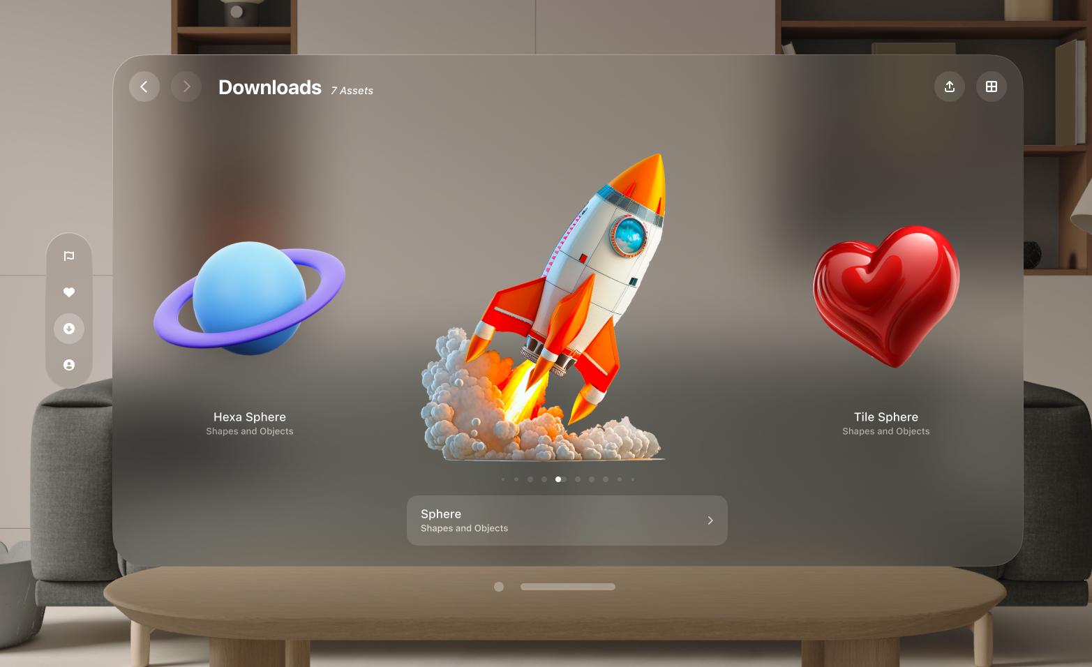
This new way of viewing content was inspired by Apple’s old Cover Flow. It lays out downloaded content in a linear order, giving users a better Augmented Reality experience, while also including an additional options to view more contextual information. This way of viewing content would work beautifully by default, but having an option to toggle back to ‘grid view’ was just as important for users who either had more than a few downloads, or for those who prefer a broader navigation view.
Following design guidelines. The VisionOS platform is an exciting new playground to play with. I was very eager to put my own spin on it, and include as much FontAwesome characteristics to the application. But there’s a level of appreciation that I had to go through when doing my research, and I had to quickly let go of those ideas I had in mind to create something effective.
Spend less time in filling placeholder content. When creating high fidelity mockups, I had a tendency to look through hundreds of images and assets. Trying to find the perfect placeholder to give me a better idea of what the final product looks like. But early on, things change. Directions shift the more I experiment with the design work, and I often find myself not using some of the placeholder content. The best way I can take this lesson in the future is to put my priorities in check. Placeholders are intended to fill in space, and once there’s something more finalized, then that’s the moment to include content for any finalizing changes.