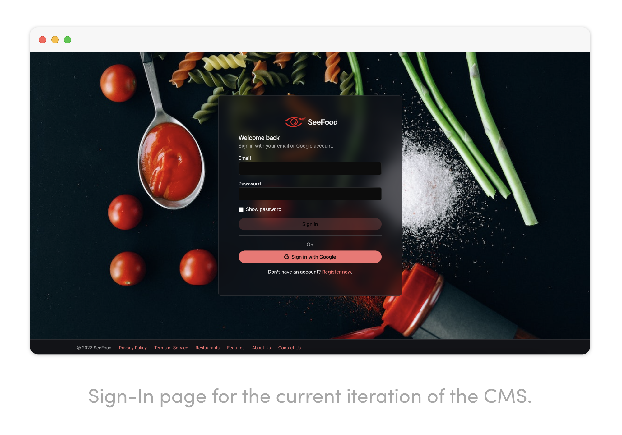
3 weeks
UX Designer
UX Researcher
Gurpreet Sidhu (Infrastructure)
An online platform for restaurants to enhance the dining experience.
SeeFood provides a powerful platform for restaurants to promote their business and communicate with a large community of users looking for their next food hotspot.

User growth and business interest has seen a slow down for the past few months. Business owners have prioritized competing delivery services to generate demand and increase revenue.
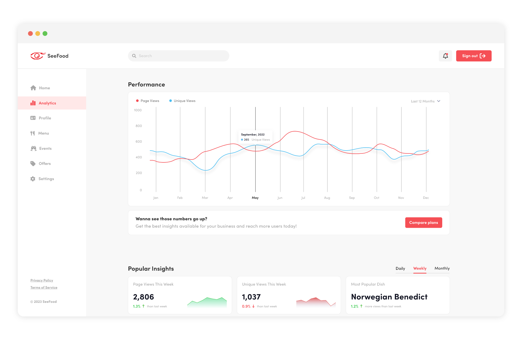
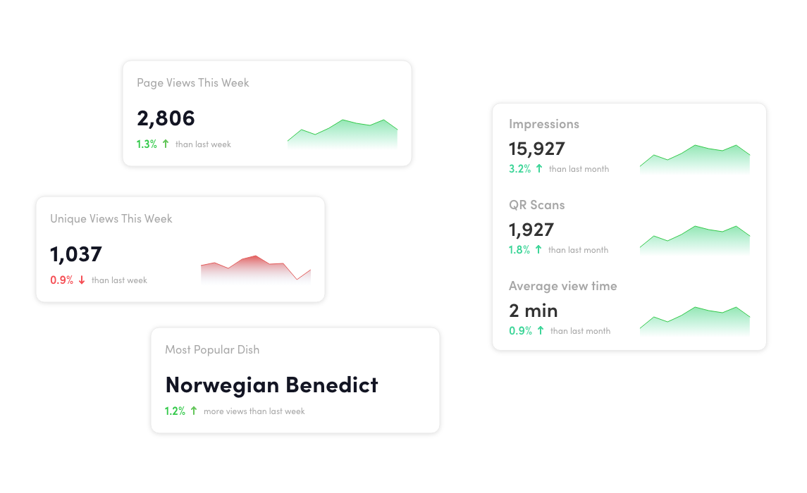
Give users the visual understanding of how many people they’re reaching out to with relevant analytics that give them insight to make business decisions.
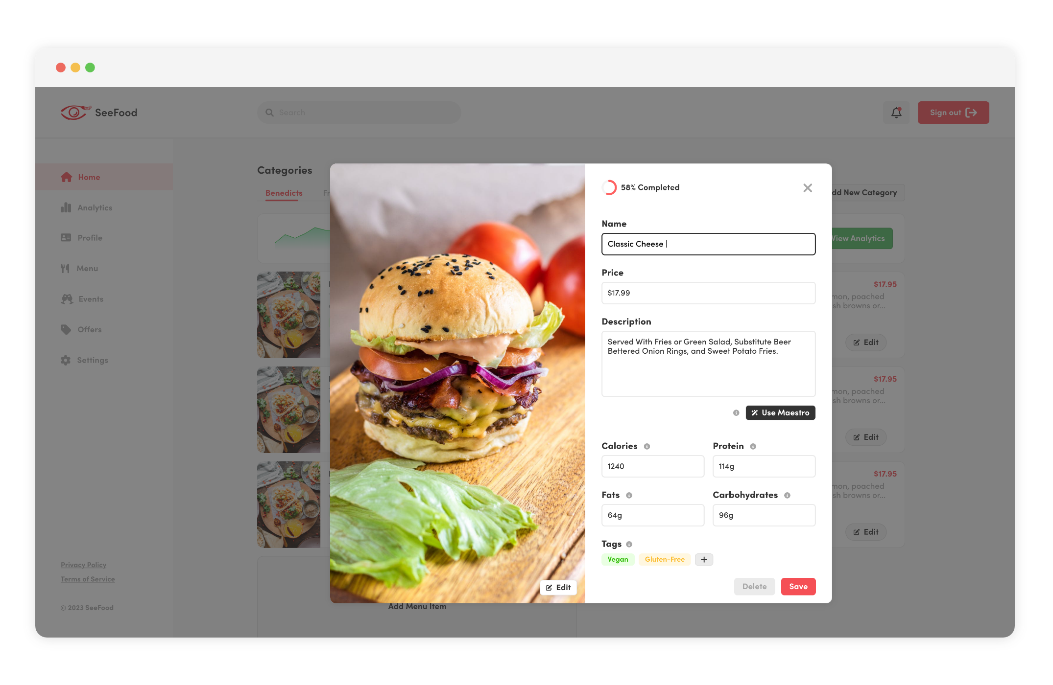
Integrate AI tools to simplify the menu adding process, while also save time.
This project came about after countless discussions about turning to a new direction to increase user engagement and strengthen restaurant relationships. Naturally, the content management system that was being developed would have to make adjustments to accommodate the solutions to those problems.
As someone who constantly spoke with business owners as potential SeeFood partners, it was hard to get through the exciting potential of the tool when it needs to be broken down on what it is. And being called a content management system is one of them. To make it easier to garner more clients and make it clear to businesses on what this tool was, I decided to work on changing the name. Something simple, and quickly explains what a CMS is.
“A portal to your digital menu.”
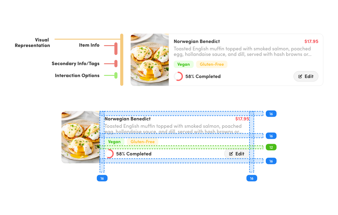
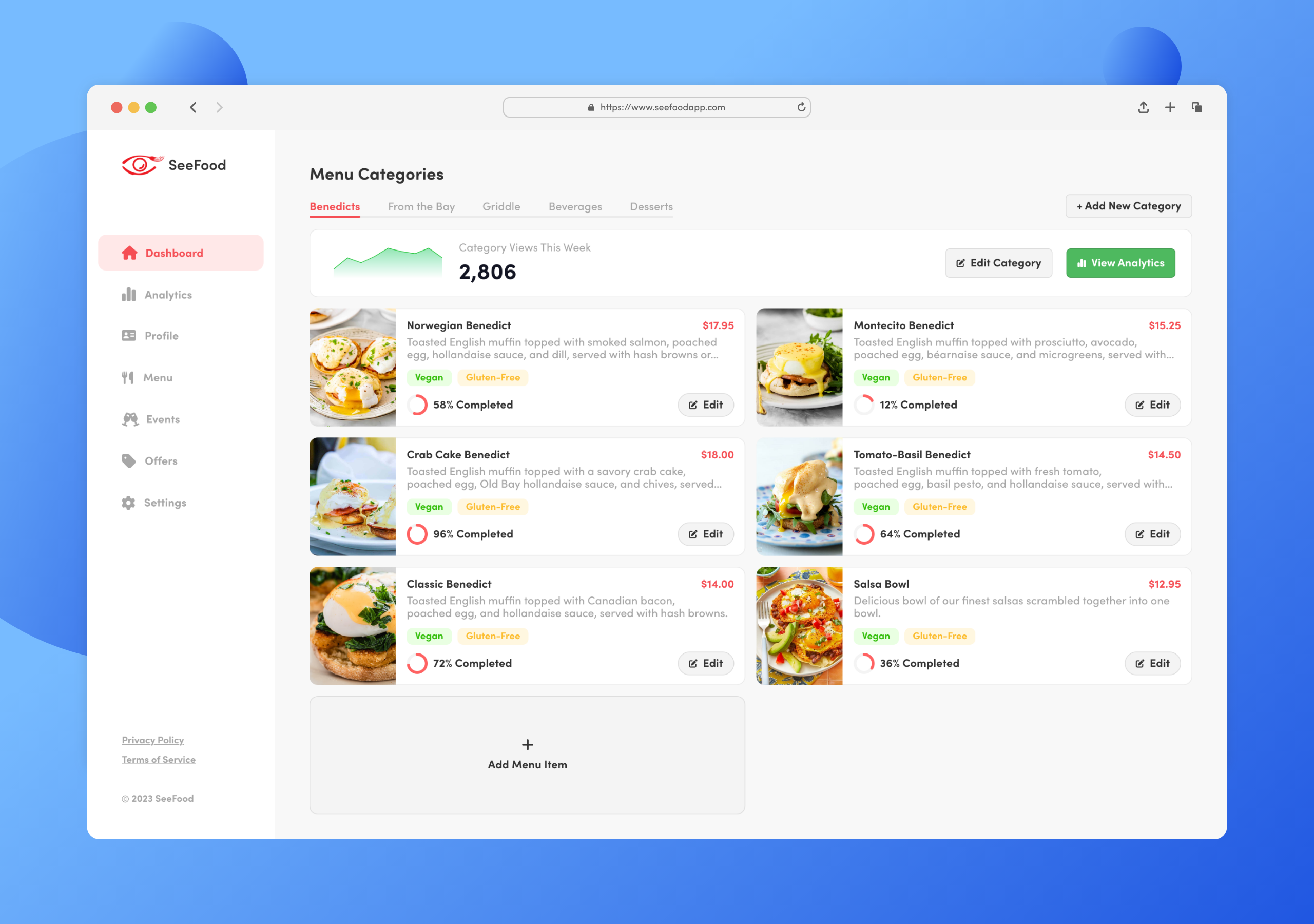
One of the themes that I worked on correcting from the start was having a streamlined design system. SeeFood had a small identity crisis in the form of having different design systems based on the platform you would be using it on. To fix this, I conformed to the system that I put in place on my last project, and made sure to continue with a consistent design.
From the previous project, it was clear that users, in this case restaurant owners, had a lot on their plate. Not only from the amount of services they had to keep up with and pay monthly for, but the amount of time they spent on each one. It was easy for them not see any value in it if there’s no clear return, or any tangible benefit.
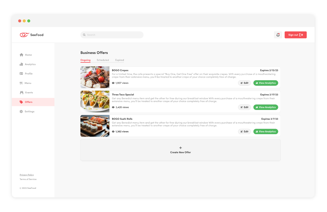
After coming up with the idea of having new forms of user engagement, it was important to give users the flexibility to add events and offers to their page. But just as important was to have a layer of transparency into how they can reach the maximum number of people by guiding them through basic SEO practices.
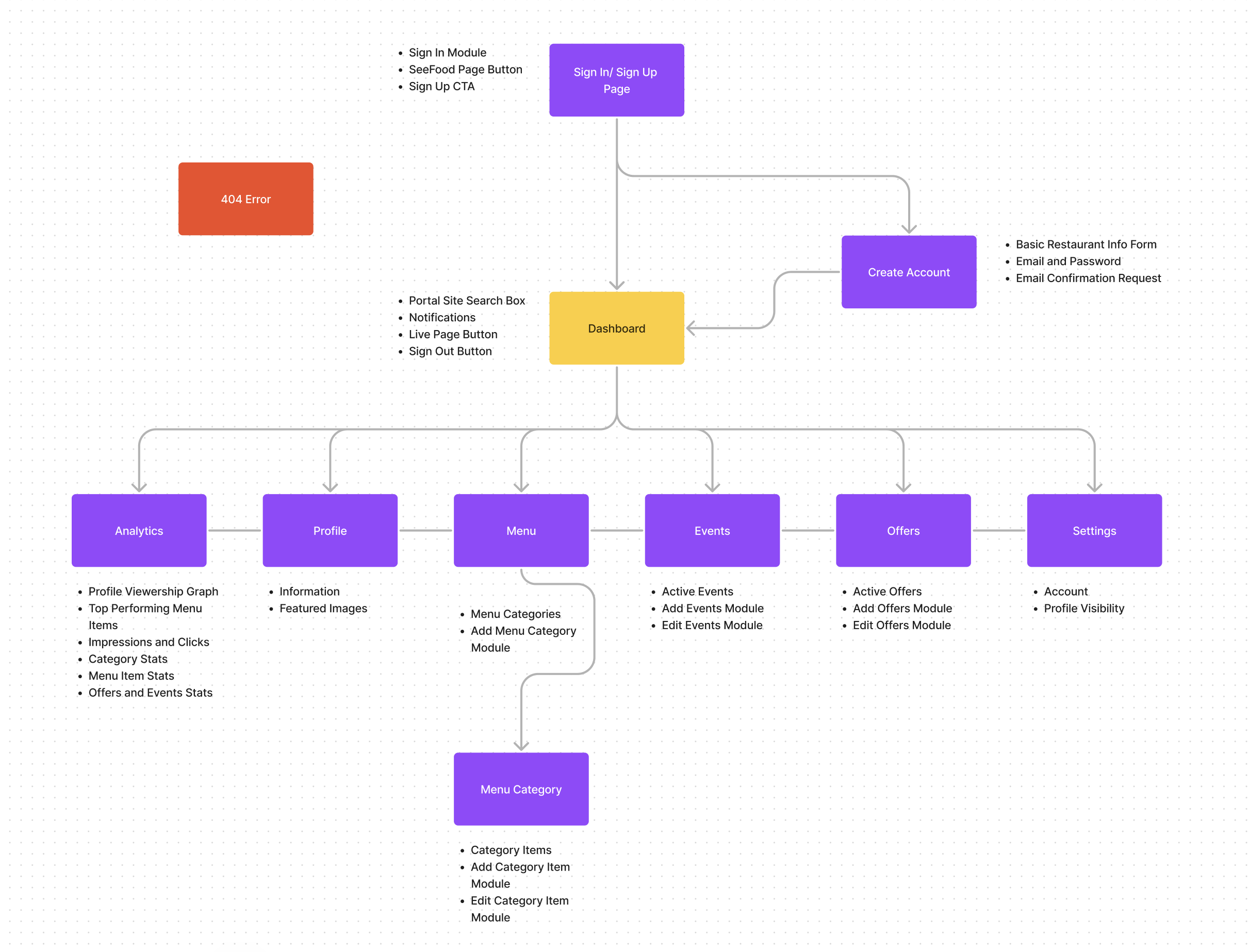
With so many features being added, and an added effort to simplify the UI for users, the last thing I wanted to do was clutter up the CMS and have them get lost in a sea of pages. But first, I needed to reorganize the flow of information, and the structure of the CMS. The best way to do this was use the dashboard as as a portal to different functions.
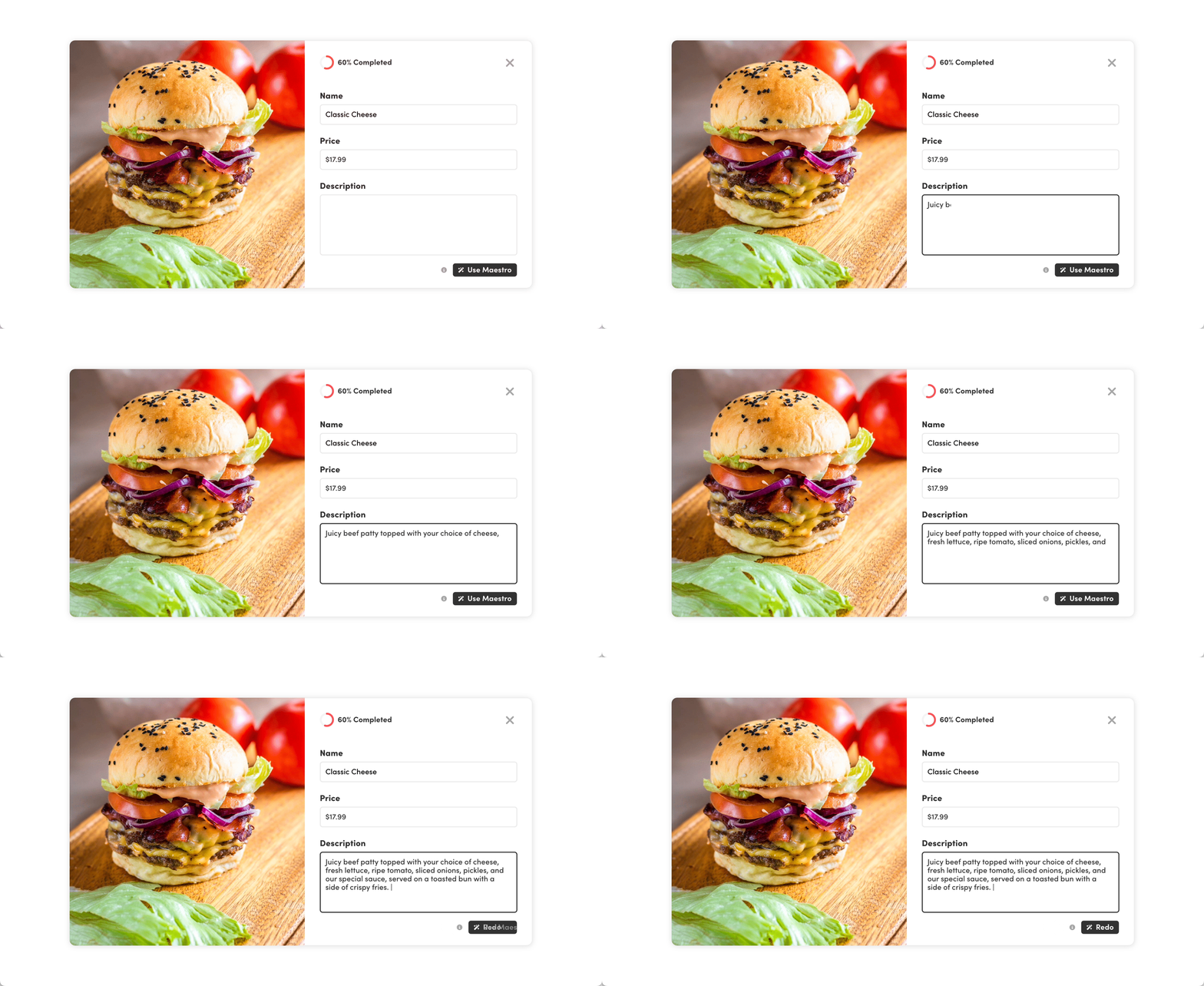
There was a hard push from the business acquisition team to include some form of AI functionality. At first, the idea of AI generated images floated around, but I quickly disagreed. This would not only cause a lot of issues with misrepresentation and grow distrust from users, but this would also go against SeeFood’s core values: The ability to see what you’re ordering. So instead of sacrificing our values, it was much more feasible to use AI to enhance the menu editing process. And one of the biggest time savers would be the option to provide descriptions on the fly for menu items.
As part of one of the themes of this project, clear understanding and transparency was fundamental in grabbing the attention of business owners. This would be a clear incentive to provide accurate information, be rewarded for it by getting more eyes on the business, and understand how to optimize their engagement on the platform.
In an effort to streamline the flow of information and user journeys, I compartmentalized the information users want into their own page. This would help keep users focused on specific tasks that brought them to the Portal in the first place, while also making it simple to navigate to the information you want.
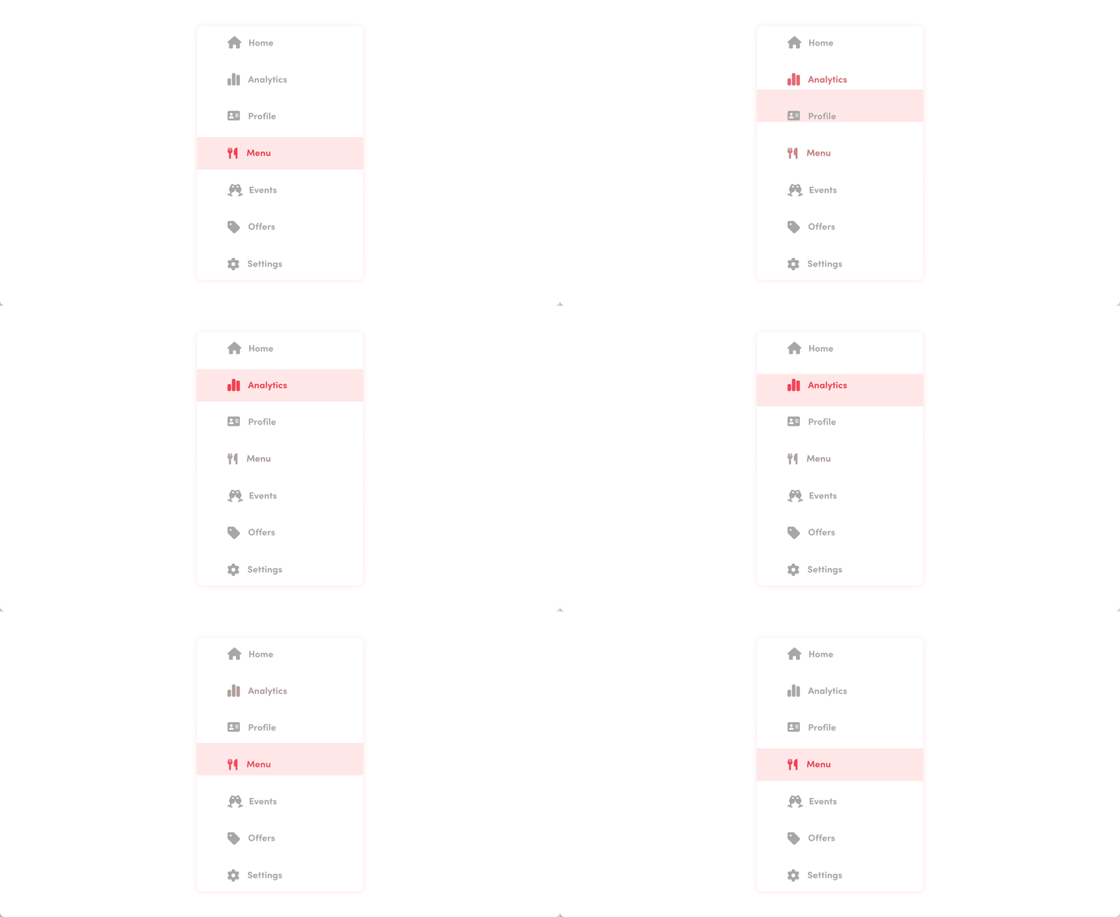
Some of the issues that we started encountering with current SeeFood partners was the understanding of their changes being made. There were some instances where the user interface wouldn’t provide any information to the user based on their actions. As a important focus for this project, I made sure to include clear user feedback while making editing choices. This would in turn bring trust into the platform, and make it user friendly.
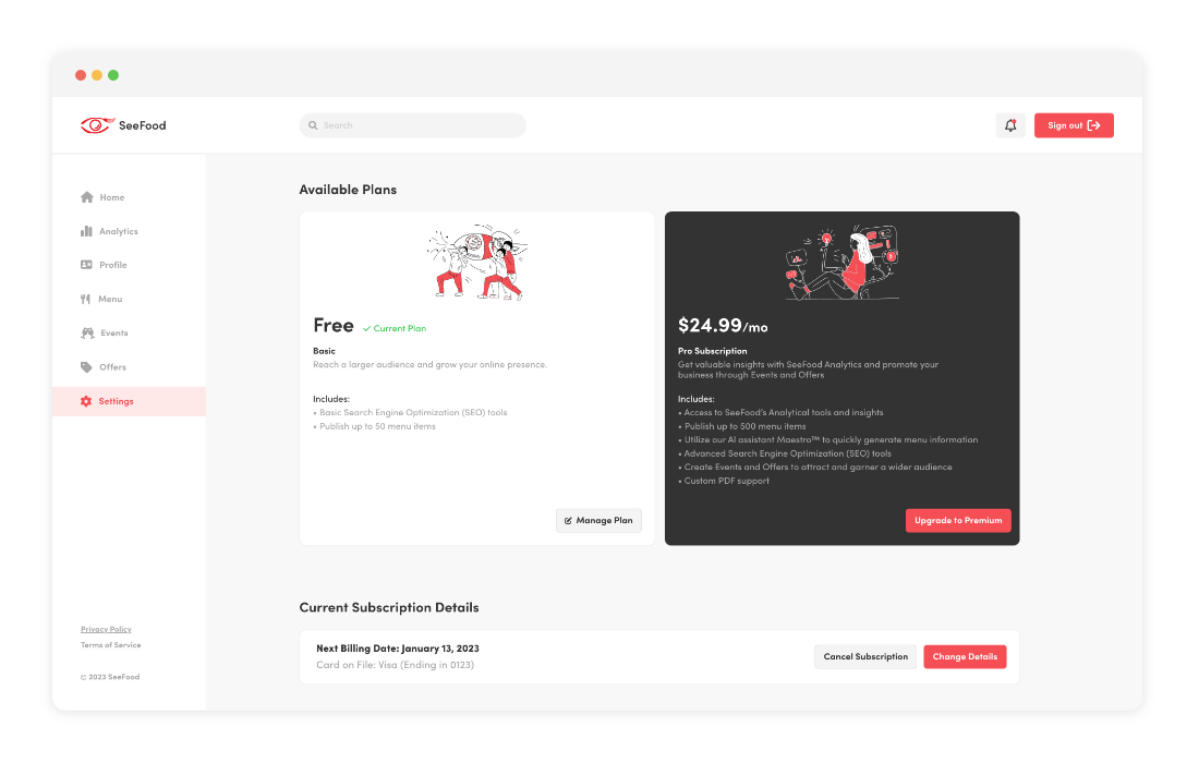
It's a complicated issue that needs to be addressed effectively to produce engagement from the users. Not only that, but the interface also has to accomaodate for users who are trying out the platform for the first time.
In order to do that, I provided clear CTA's through the portal to direct users to this page. This subscription page would indicate the subscription tier the user is in, while also outlining the benefits for upgrading. Managing payment methods, billing dates, and cancellation options are also included to give the user control. Moving to the payment option would then follow the Stripe process, which is then automated from Stripe services. But the user would already have a clear distinction and understanding of what they're paying for, and what they're getting out of it.
As a content management system, my biggest priority is to make sure users understand how to maneuver through the site, while also empowering them with the necessary tools strengthen their business. It’ll be equally important to keep track of the amount of information business owners start adding, how the reception of the AI tool is being utilized, if its generating relevant description, and if there’s an uptick in interest to supply the platform with accurate information.

Don’t fix what isn’t broken. The biggest hurdle I had to overcome was understanding that not everything present in the CMS had to be redesigned. Some components didn’t need reinventing, and it was better to prioritize areas that would accomplish the goal of the project.
There’s no need to reinvent the wheel. With a CMS, making sure users are familiar with the UI and can maneuver through it was essential. The last thing the user needs is to start learning a new experience. So being derivative, in a way, would make it simple to manage. I spent a lot of time early in the project trying to justify different creative directions, when that really just took away from the theme of simplicity.