10 weeks
UX Designer
UX Researcher
Gurpreet Sidhu (Infrastructure)
SeeFood is an online platform design for restaurants to enhance the dining experience.
For the past three years I’ve been working with this startup that aims to digitalize menus and break the visual barrier between customers and their next meal. The platform gained traction during the pandemic, and provided restaurants with QR codes to adhere to the COVID guidelines.
View Prototype
Seefood, which experienced rapid growth during the pandemic, now faces challenges in retaining user engagement and restaurant partnerships. As traditional dining returns, it occupies a unique position in the market, appealing to discerning users but perceived as an added expense for restaurant owners compared to established delivery services.
The dining experience extends beyond menu browsing, and Seefood should too. While Seefood provides comprehensive information for ordering, a central hub offering additional updates and insights bridges the gap between users and restaurants.
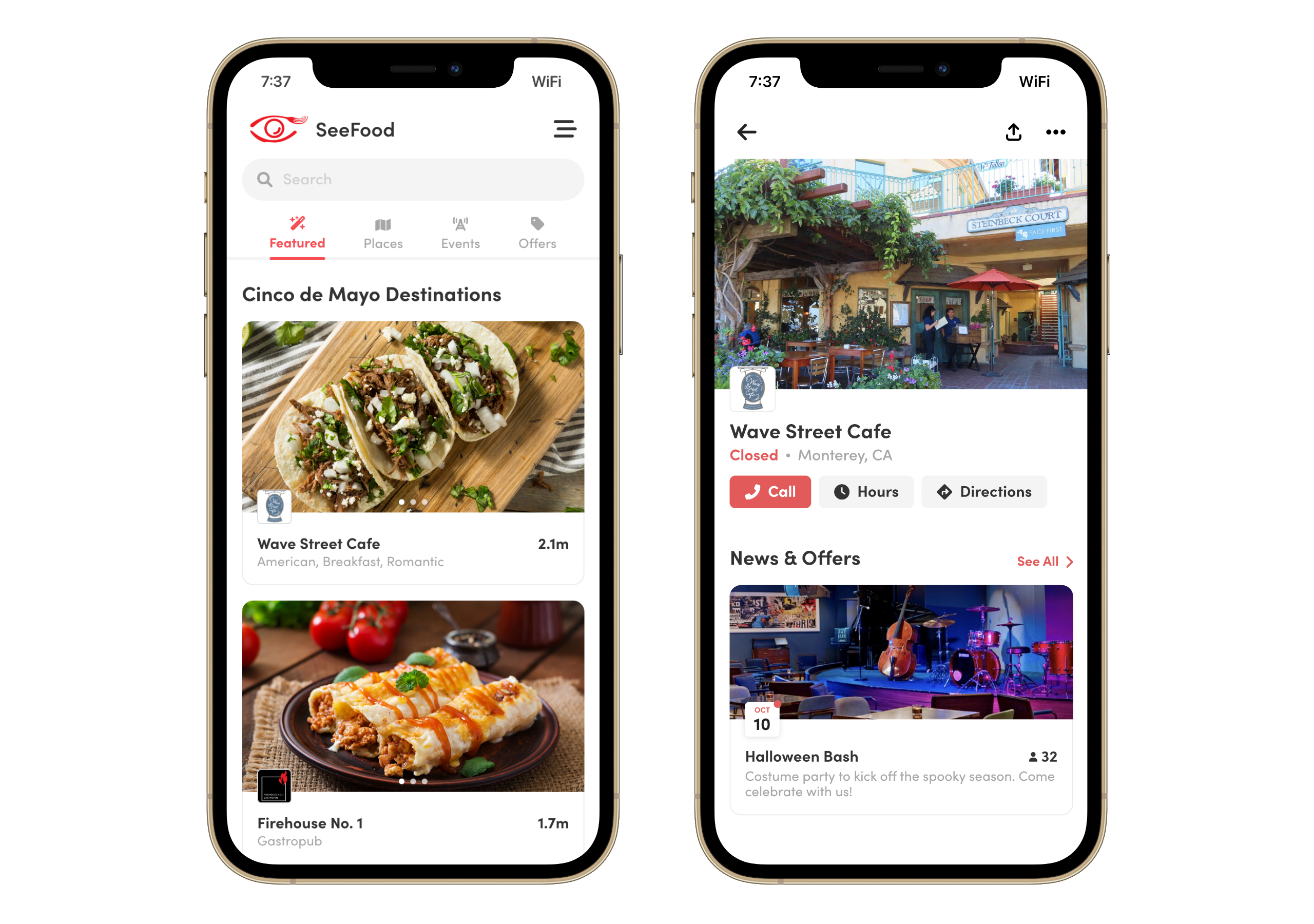
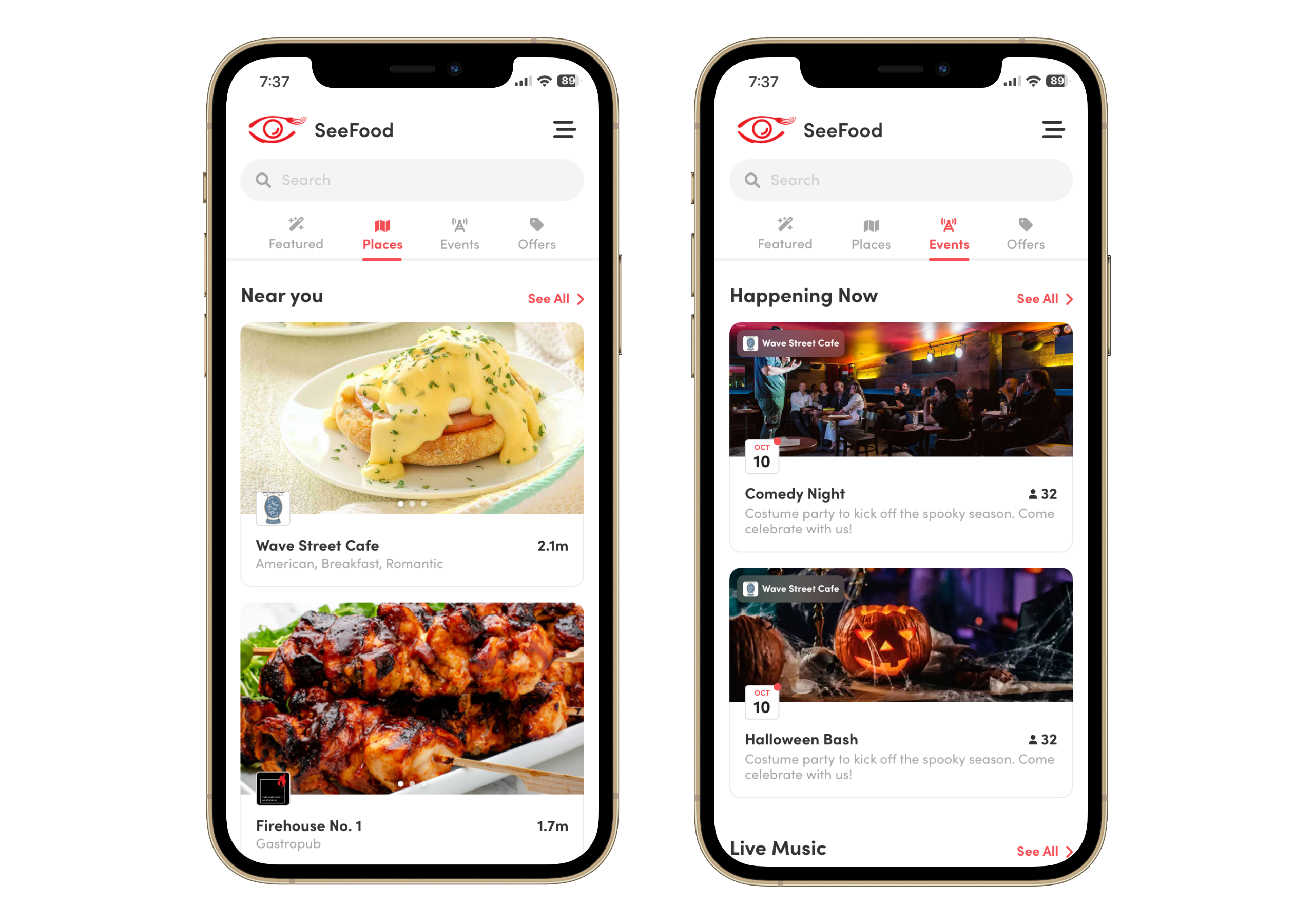
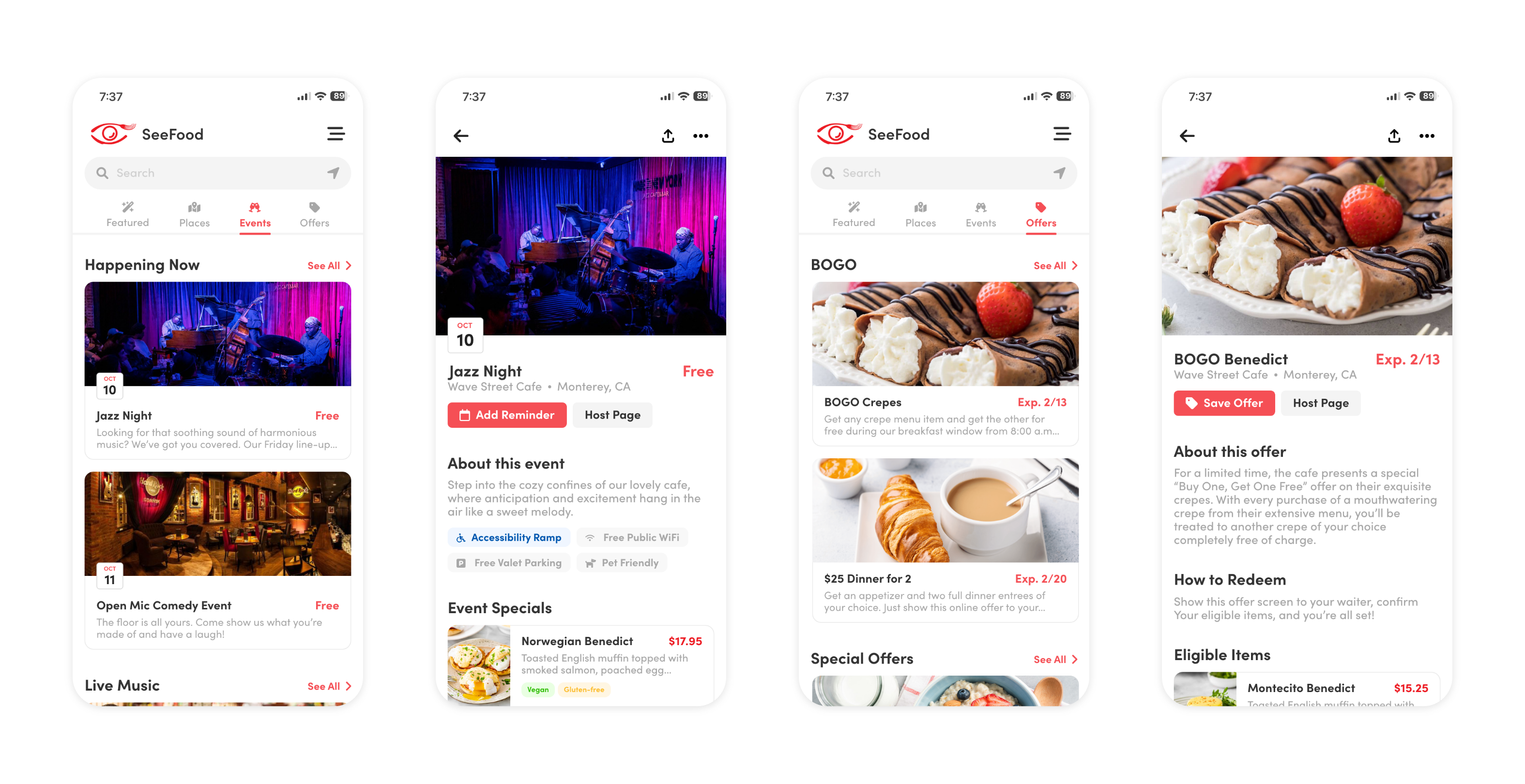
Dining choices involve more than just cuisine type. The introduction of Events and Offers adds depth to Seefood, helping users explore restaurants from new perspectives and giving establishments an additional avenue to promote their businesses.
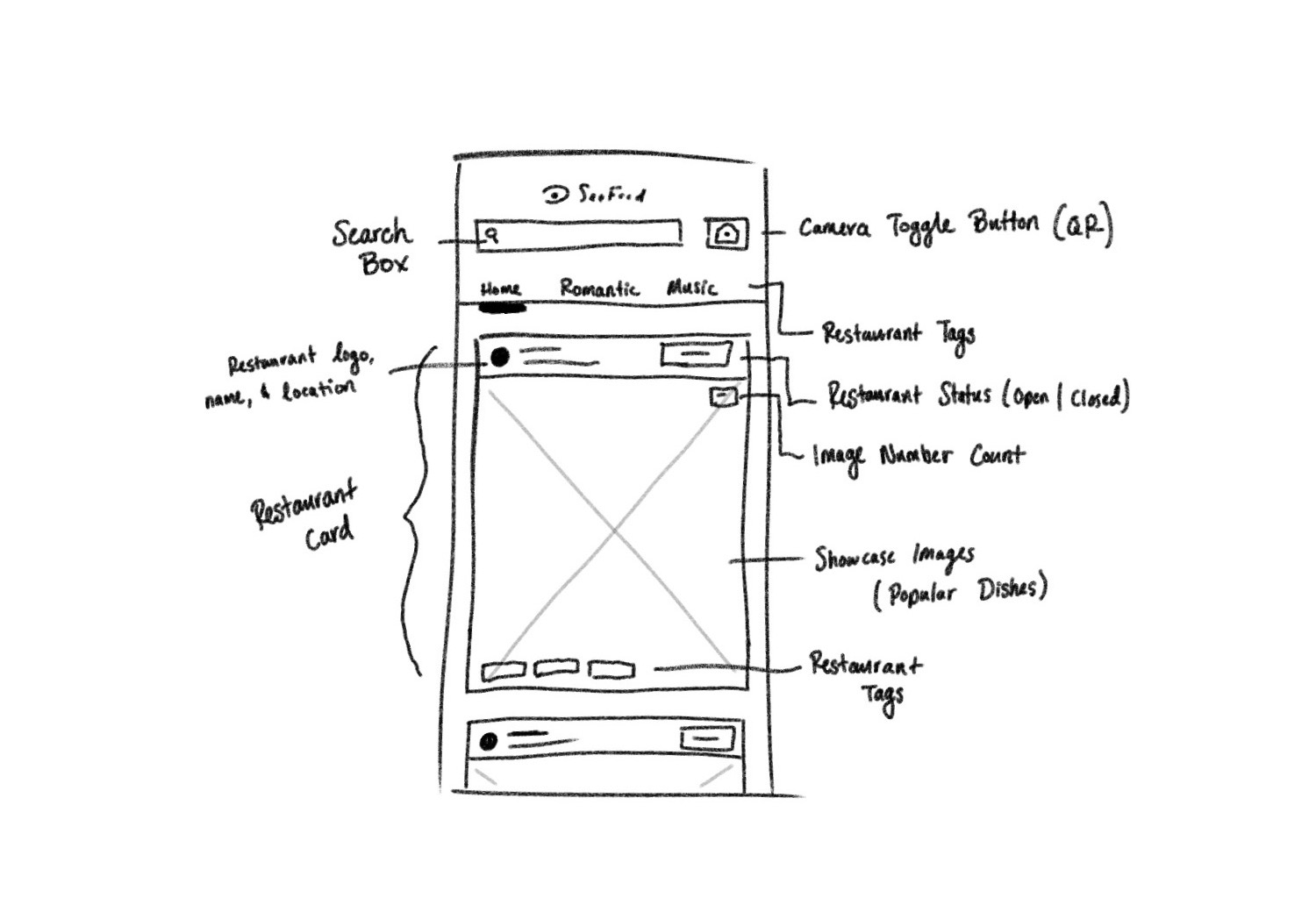
Organizing restaurants and menu items with tags not only streamlines search results but also enhances user transparency. Tags offer a clear way to navigate and understand the offerings, improving the overall user experience.
Our growth stagnated, leading to brainstorming sessions focused on restaurant strategies. However, I recognized the core issue was user-related and took the initiative to conduct a comprehensive analysis, aiming to pinpoint problems and propose solutions for our team's turnaround.
This highlights a significant underlying issue, suggesting that either users are not finding what they need and consequently leave, or they are not engaging with the menu page at all. The latter scenario is particularly concerning and has the potential to inflict the most damage on our platform.
According to a Gallup report, customers typically spend an average of 109 seconds reading a physical menu. Drawing this comparison underscores the imperative for a digital menu to replicate the same level of engagement as its physical counterpart.
Research conducted by OpenTable reveals that modern customers are thorough in their pre-ordering investigations, considering factors like pricing, menu choices, restaurant location, special offerings, and dietary accommodations. These aspects significantly influence their dining decisions.
Furthermore, as reported by SocialMediaToday, an impressive 30% of millennial diners actively steer clear of restaurants with a lackluster presence on Instagram. It's important to note that Seefood's competition isn't limited to other delivery services; it also includes social media platforms, which provide businesses with ample opportunities to showcase their unique offerings and cultivate brand awareness.
In today's digital age, successful restaurants use social media to distinguish themselves. By showcasing their personality and specialties, they attract and retain customers in a crowded marketplace.
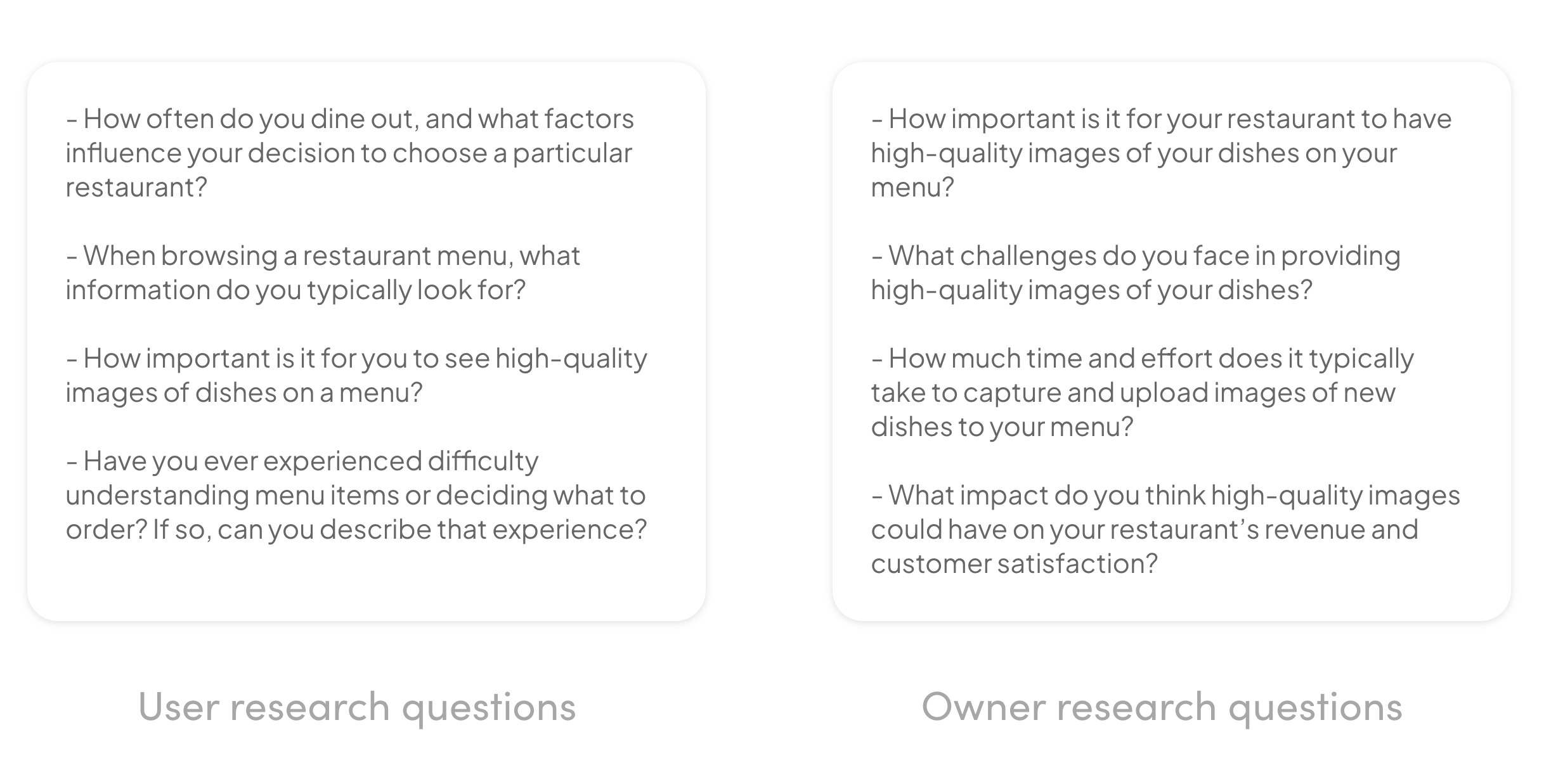
Discovering that many SeeFood partners used multiple online delivery services prompted an investigation into these services. While they offer automation, which can be a time-saver for restaurants, they also pose control and cost challenges. Additionally, I conducted user research to gauge user objectives and assess the value of a digital experience compared to traditional menus for a diverse user base.
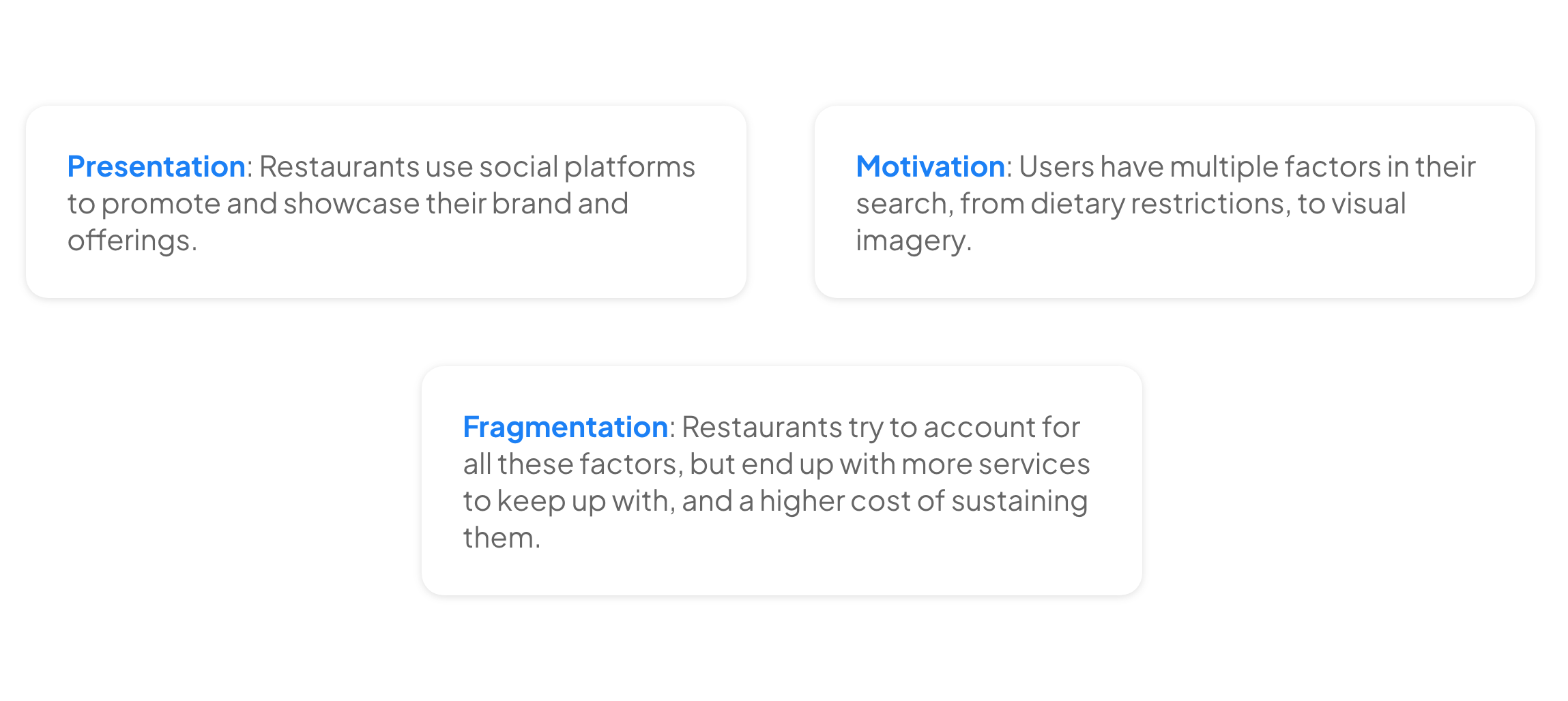
In the course of my research, it became glaringly apparent that the prevailing industry landscape was marked by a compartmentalized approach. Many existing services and platforms were tailored to deliver specific, albeit disjointed, solutions to businesses. For instance, one service might handle online menu management, while another focused on customer reviews and yet another on social media promotion. While each service served its purpose, this disjointed strategy inevitably led to several critical issues:
1. Higher Costs: Maintaining subscriptions or contracts with multiple service providers not only added up to significant recurring costs but also required businesses to invest extra time and effort in managing various relationships.
2. Fragmented Online Presence: When businesses opted for this segmented approach, their digital identity became fractured across multiple platforms. This made it challenging for potential customers to discover and engage with them online seamlessly.
3. User Confusion: Users were often left bewildered, having to navigate a maze of different apps or websites to interact with their preferred restaurants. This complexity discouraged user engagement and could potentially drive them to competitors who offered a more unified and user-friendly experience.
Given these pressing issues, it became increasingly evident that there was a clear opportunity to provide restaurants with an integrated platform like Seefood, which not only simplifies their online presence but also reduces costs, fosters brand consistency, and ultimately enhances the overall user experience.
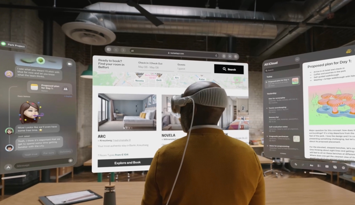
AR menus aligned with SeeFood's goals, but obtaining restaurant 3D content and developing backend support posed challenges that were beyond the scope of this project. So it was left in the back burner for future consideration.
I regrouped with everyone to present my findings, how our competition goes beyond what we initially thought, and how we fair against them. At this point in time, we were also in the middle of developing our own CMS to make it easier for restaurants to edit their platform page. But this came in conflict to what I was presenting, since the CMS only allowed the basic information to be changed.
It was clear that the CMS too would have to be redrawn later down the line to meet the challenges we’ve been facing.
One of my initial approaches was to resize images to conform to the typical dimensions found on popular social media platforms. However, further exploration revealed a practical limitation—most businesses do not have their menu items photographed at this scale. Additionally, adopting such dimensions would restrict the user's ability to view multiple restaurant options simultaneously.
However, this presented a valuable opportunity to not only uphold the existing brand essence but also to elevate its purpose through thoughtful design choices.
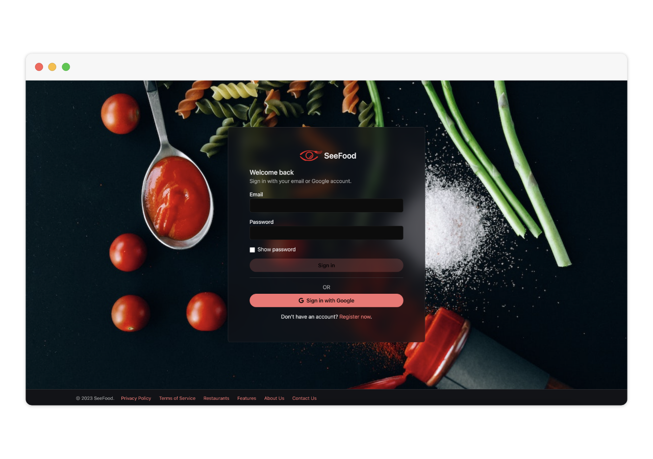
1. Color Palette: Elevating the Essence The cornerstone of this design evolution began with a careful consideration of color. It was imperative to maintain brand consistency, and the vibrant 'SeeFood Red' (#F54F55) served as a pivotal accent color that resonated with users. To create a harmonious visual experience, we complemented this vibrant red with subtle shades of white and black, allowing the user interface to breathe and ensuring content clarity. This careful balance of colors created a fresh and inviting environment for users to explore.
2. Typography: Playful Yet Readable Typography played a crucial role in setting the tone for the Seefood brand. It was imperative to strike a balance between invoking a playful and approachable atmosphere while maintaining clean, legible text for ease of use. Through meticulous font selection, I achieved a nice blend, ensuring that the typography mirrored the brand's personality.
3. Component Design: Fostering User-Friendly Interactions Every component of the user interface was meticulously designed with the user's needs in mind. To enhance the overall user experience, we applied consistent principles across all components, including uniform border radius adjustments. By replacing traditional box shadows with a subtle gray border that complemented the background's gray tint, we created a more user-friendly and modern design aesthetic. This small yet significant change served to emphasize the content and interactions, offering a more intuitive and visually pleasing experience for Seefood users.
In essence, this design process aimed not only to maintain Seefood's established brand identity but to enrich its purpose. By incorporating these thoughtful design elements, I sought out to elevate the overall user experience, ensuring that Seefood's design language would not only be functional, but a delight to engage with.
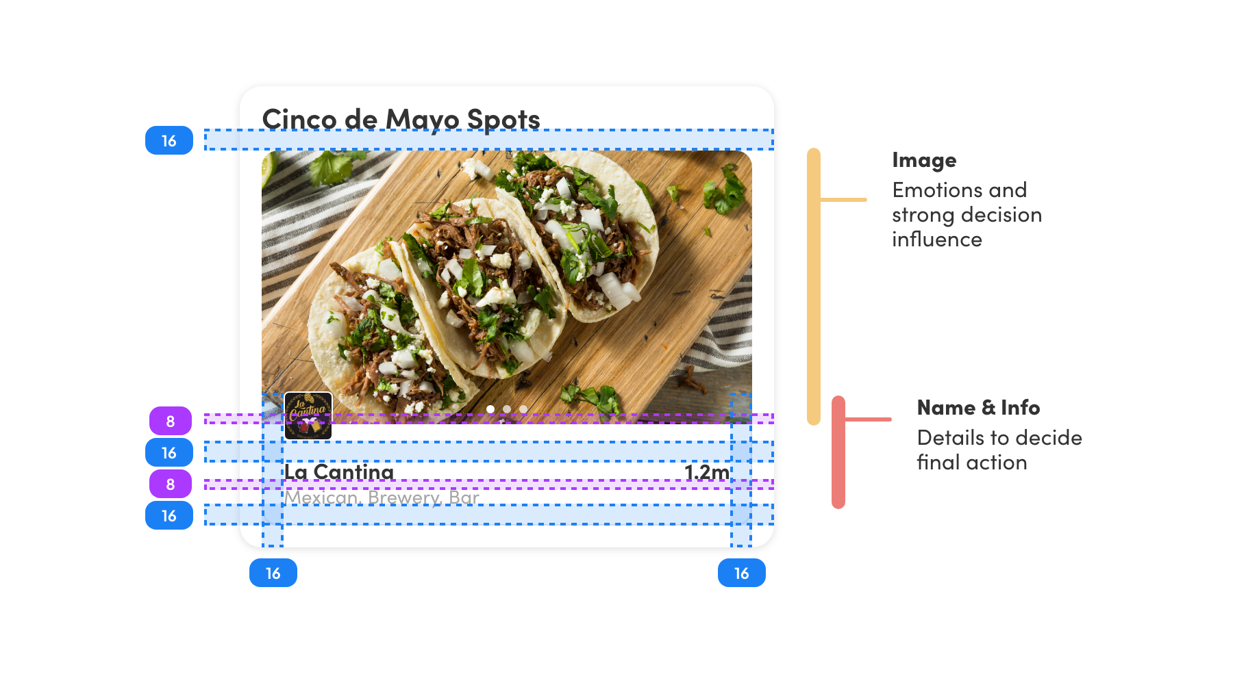
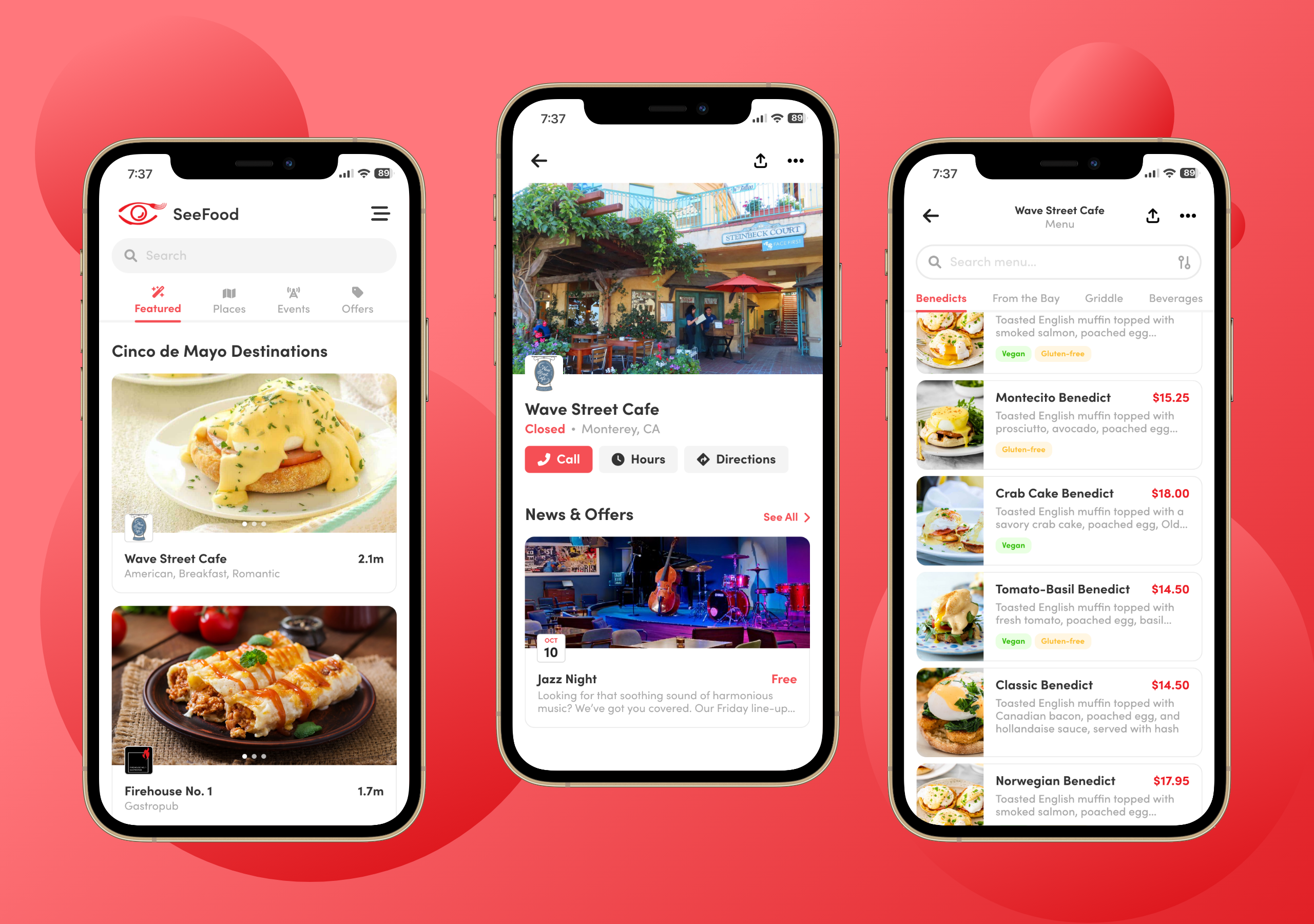
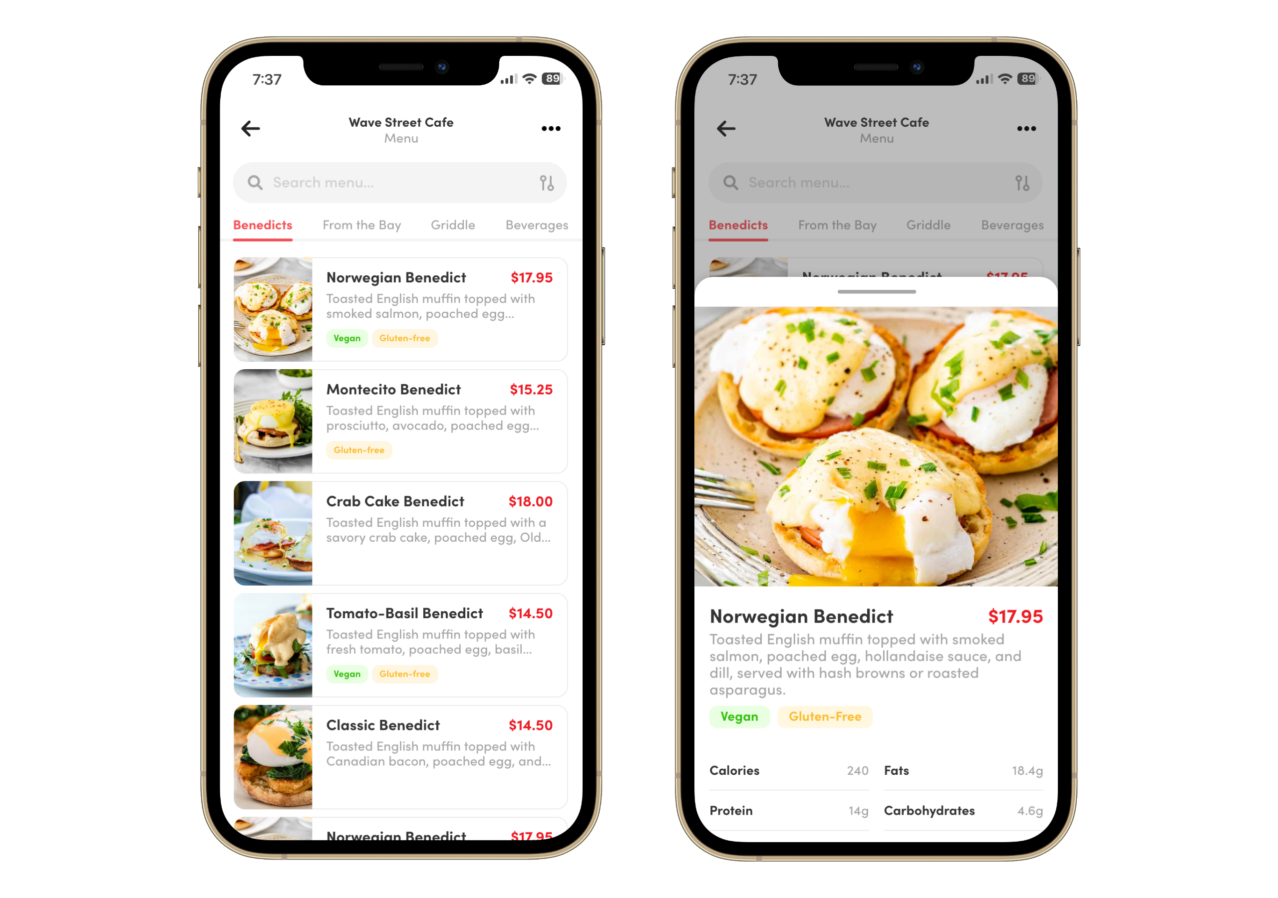
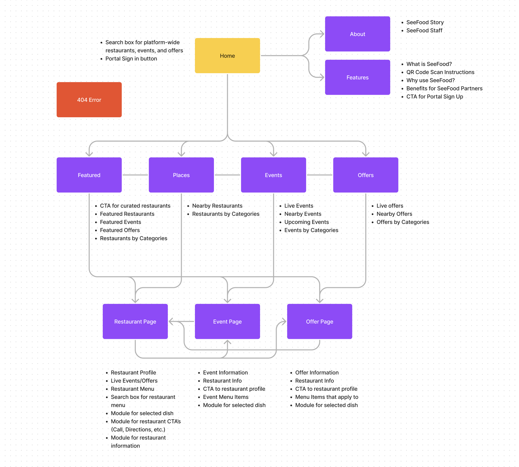
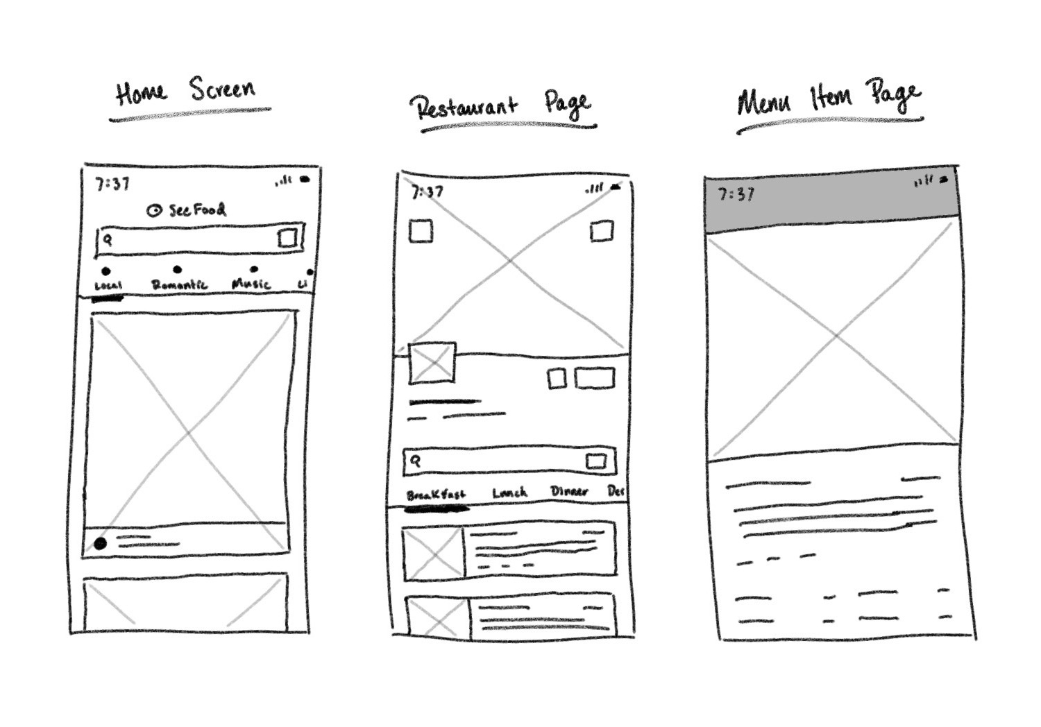
From the start, I knew the main homepage would have to get change drastically. Previously, the homepage showed the list of restaurants, with the showcase image being a picture of the business. And while this gives context to the user of the restaurant setting, that’s not enough to entice the user between one restaurant from another. Replacing that image with the top dishes gives better insight into what the user is looking for.
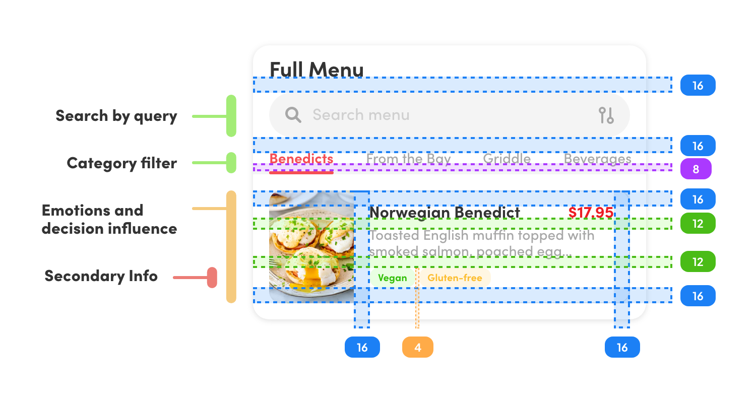
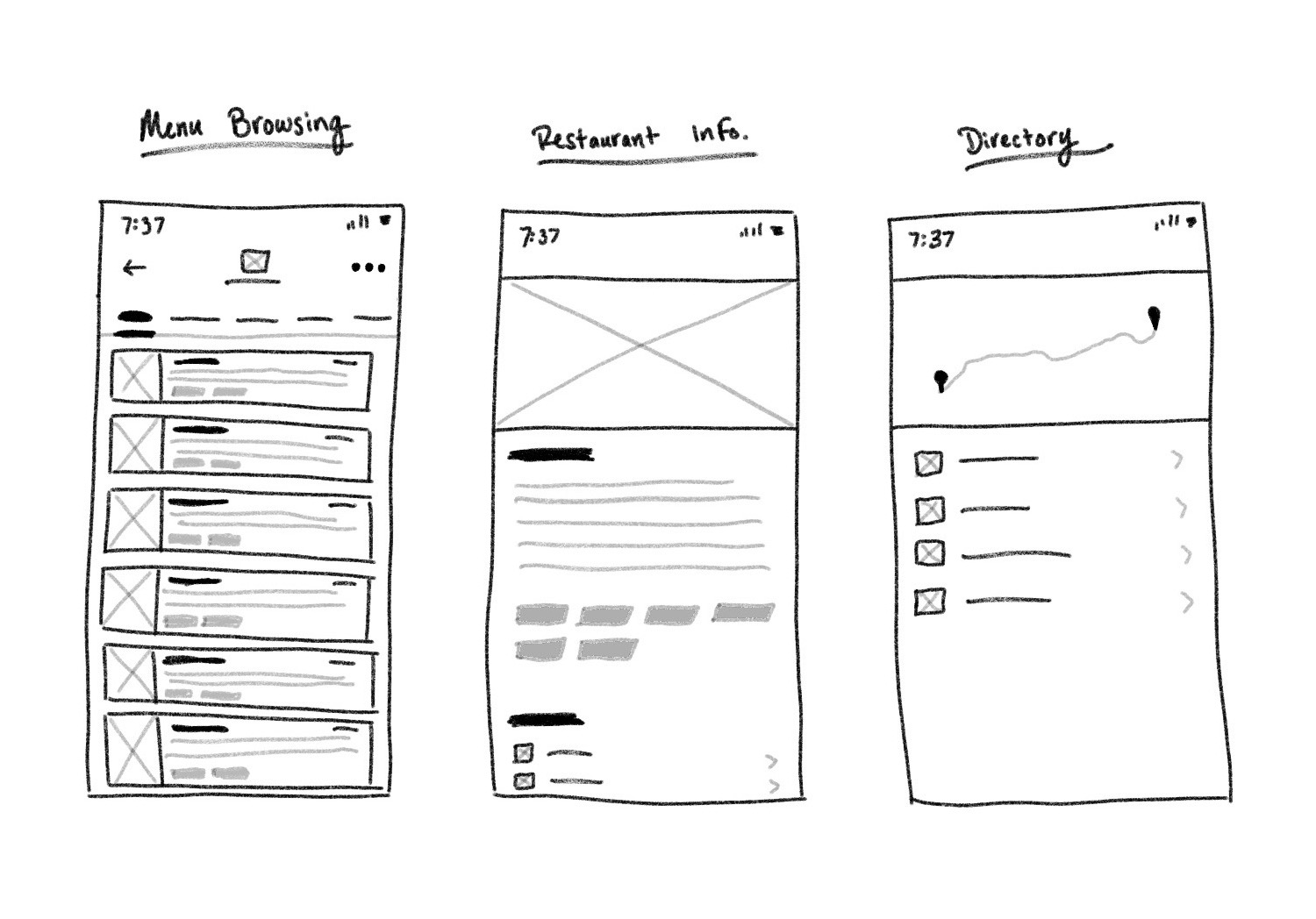
The restaurant page has so much to deliver, so every piece of information has to be purposeful. Otherwise, it can get very crowded really quick. So the most crucial information has to be presented here, with additional information being easily accessible for users.
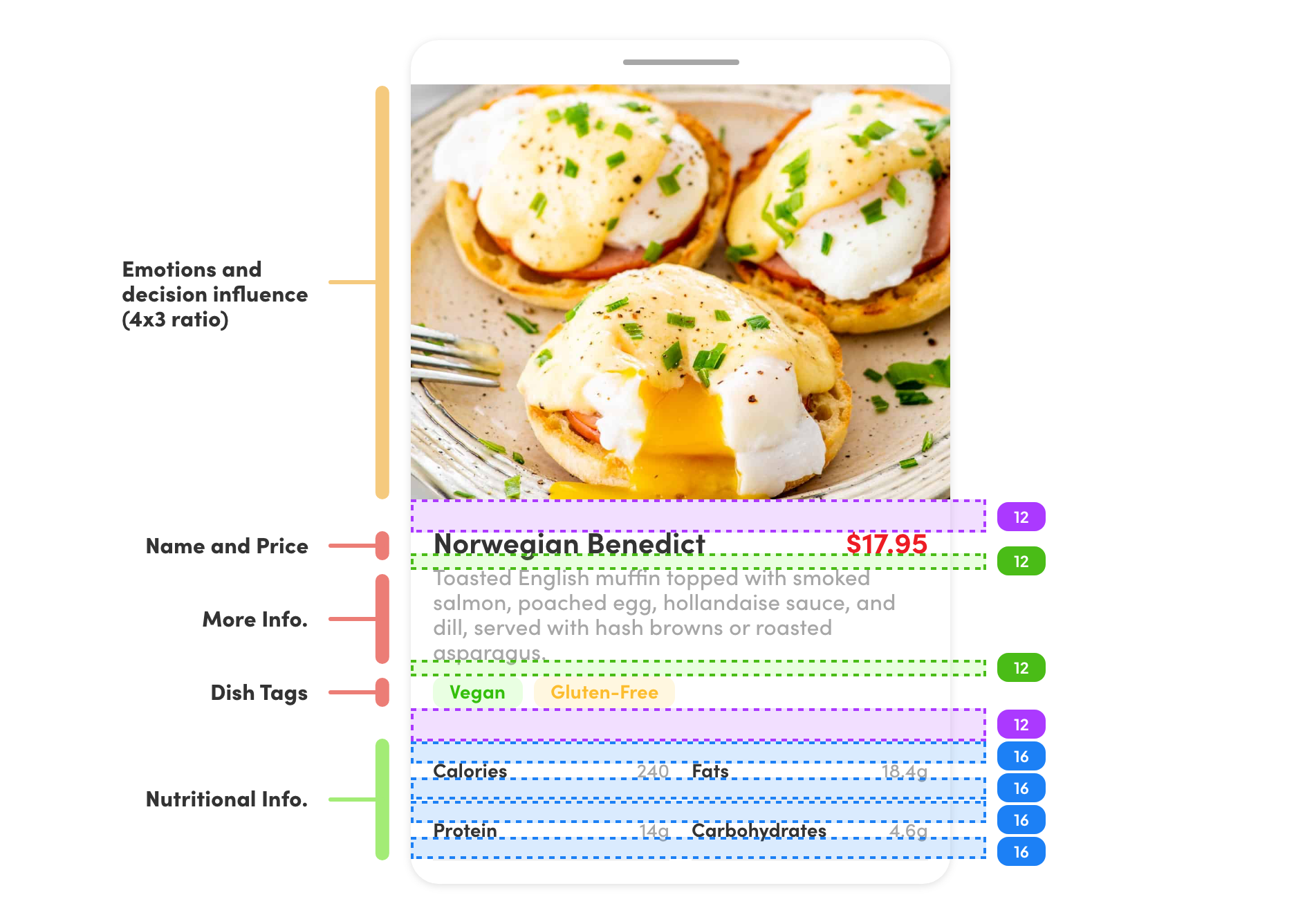
Keeping the dimensions the same as other social media platforms was intentional. Not only does it make it easier for businesses to provide menu images, but makes the platform familiar for users. Secondary information helps give a deeper understanding of what users value, with nutritional information, and dietary restrictions.
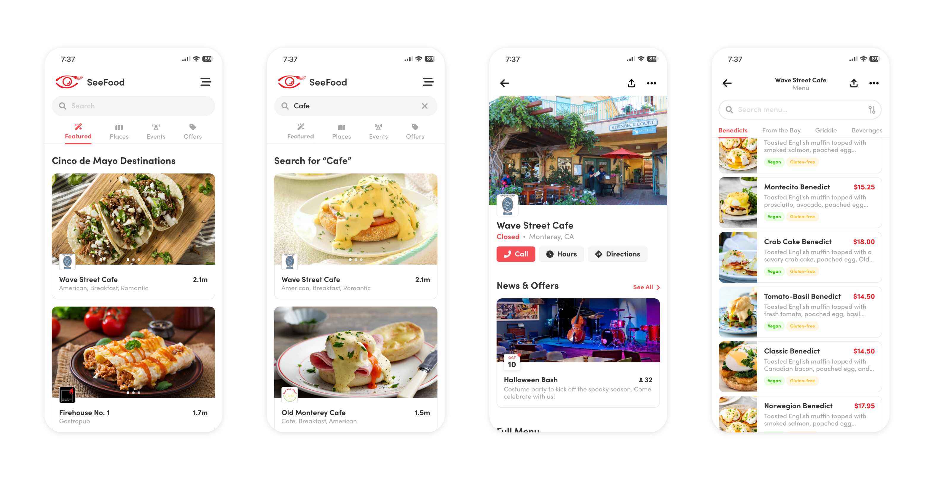
The research revealed that customers consider a myriad of factors when selecting their next culinary destination. With this insight in mind, our primary objective was to ensure that users have immediate access to an array of dining options that cater to their diverse tastes and preferences right from the outset. Whether users are in search of a local gem, a specific cuisine type, options for dietary restrictions, a venue with live music, a cozy bar for socializing, or an irresistible special offer, Seefood's interface is thoughtfully designed to present these choices without overwhelming the user.
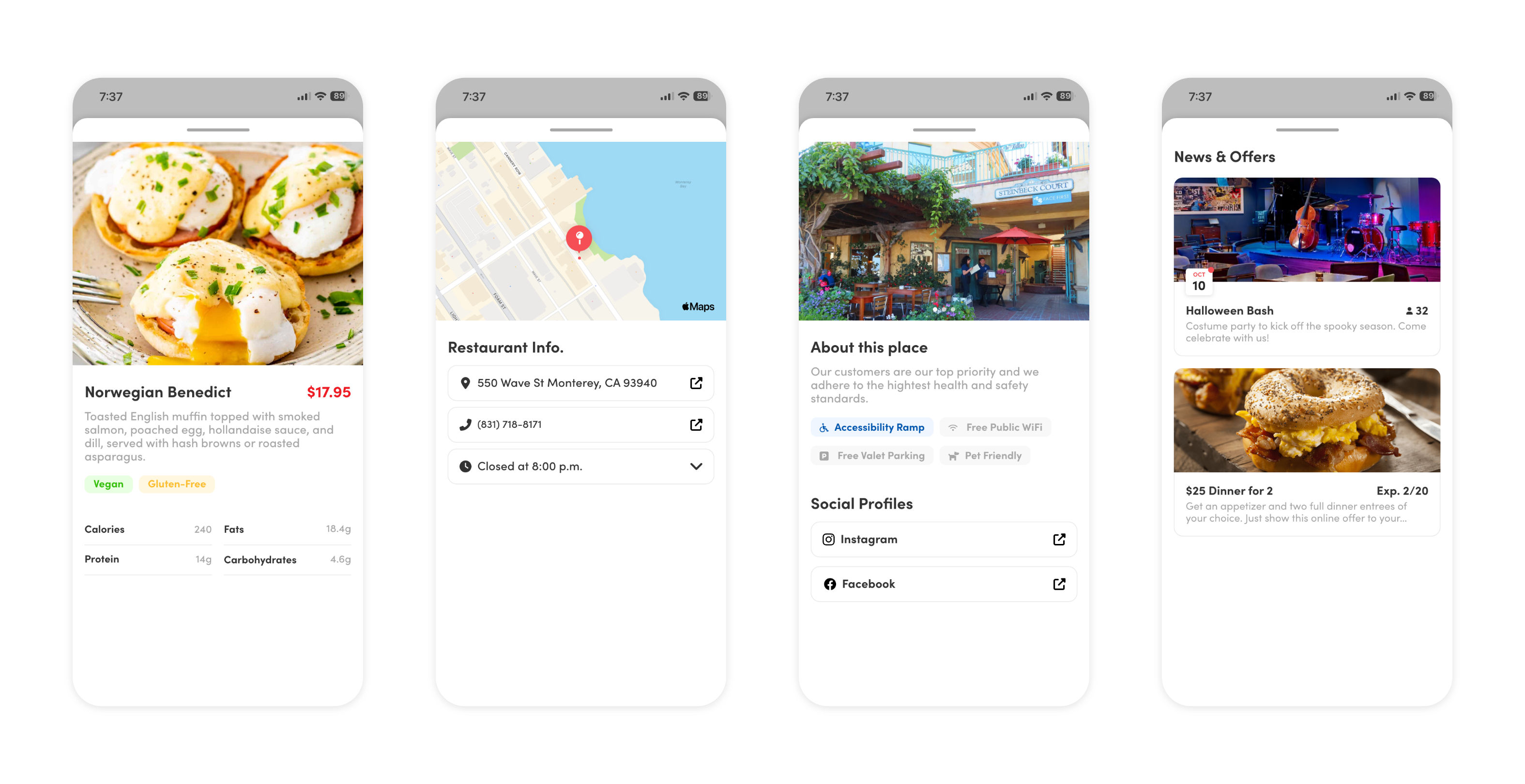
This page serves as the embodiment of the promise hinted at in the initial glimpse provided to the user. It's where the art of presentation takes center stage, seamlessly offering a curated experience that encapsulates the restaurant's ambiance, updates on its latest developments, and an effortless menu exploration that shows what the establishment has to offer.
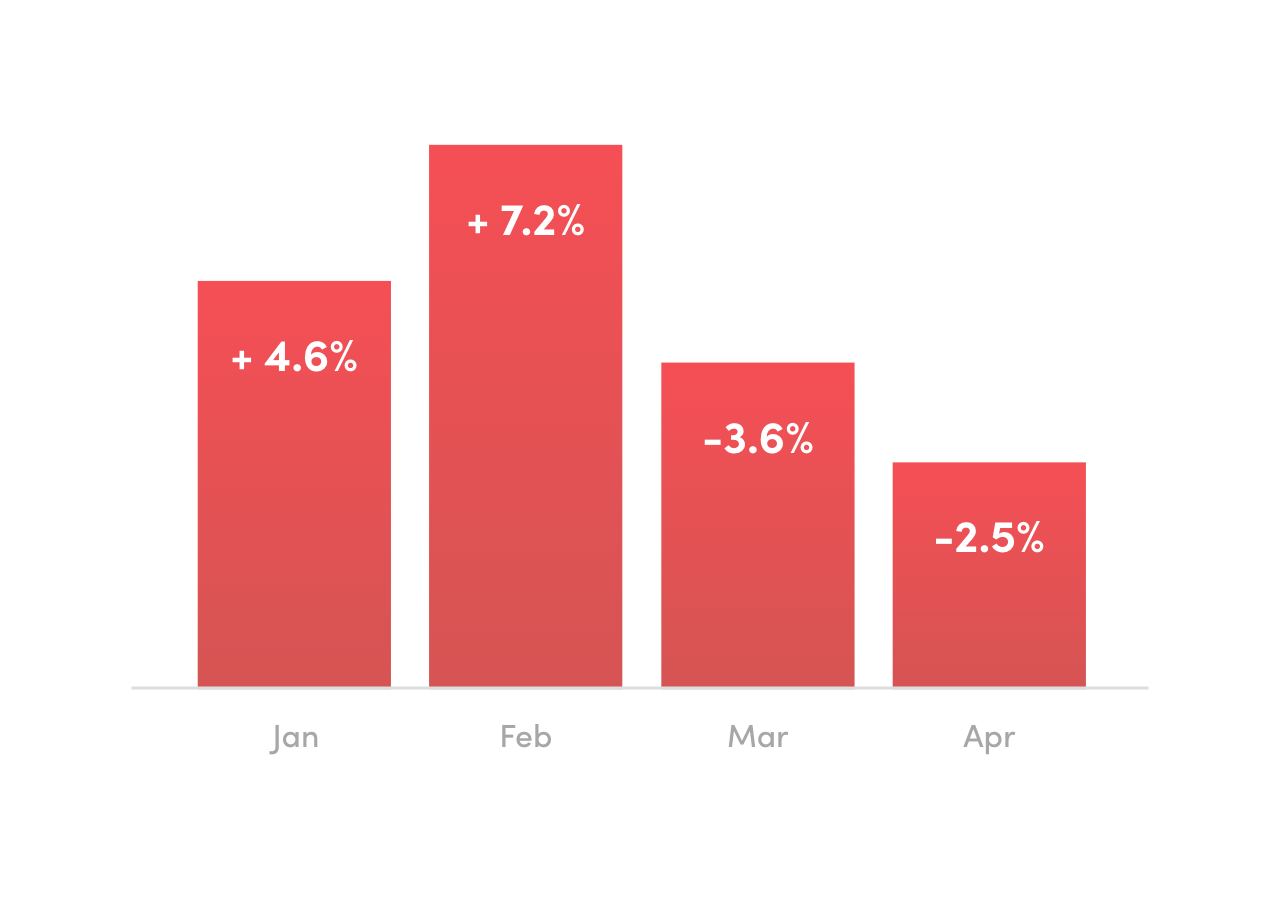
I conducted some user testing with an A/B test for featured image height and 9 usability tasks with 34 users to test out my mid-fidelity wireframe and identify users' insights and potential pain points with the design.
61.76% (21/34) Were able to understand the home page navigation and look through restaurants, events, and offerings.
91.17% (31/34) Found the Events and Offers tab useful to narrow down search.
Providing these diverse options served as a means to offer users a vivid preview of what awaits them. In today's digital age, diners frequently turn to online research to shape their dining experiences, whether they seek a romantic dinner setting or a lively, music-filled atmosphere. It became evident that this multifaceted approach had myriad applications. First, it catered to users who may not have a specific experience in mind, helping them discover a dining setting that aligns with their preferences. Simultaneously, it offered an avenue for restaurants to showcase themselves in a captivating manner, effectively promoting their unique offerings to a receptive audience of potential patrons.
I spoke with the team about the needed changes and proposed the necessary advancements to stay competitive and bring more users to the platform. Once the changes are made, we’ll be monitoring daily users, how Events and Offers are received by users, and if there’s growth in our retention rate.
Get the right insight from research. After a few weeks of research and development, it’s easy to get lost and drift from the objective. I insisted on having a larger dish image to showcase a restaurant, since it would be more engaging for the user and highlight a restaurant’s offerings. But this slows down exploration, the proportions aren’t conventional to what a restaurant already displays, and the image ultimately isn’t the last deciding factor. So although I was right, they didn’t coincide with the end goal for this redesign.
Ideate as much from the get-go. There were a lot of iterations that I went through the project. Three to be exact. And every time I went through another cycle, it was because I delved deeper into the design, and saw an opportunity to improve on it. More importantly, I was able to get a better understanding of why certain designs work more effectively than others. This will save me some time in the future, and gives me a better sense to obey WCAG standards.
Perfect is the enemy of good. There’s always an opportunity to improve, but I learned through those various iterations that it’s important to get through those choices during ideation. It saves time, and puts more hours spent on a design that’ll see the light of day. So as much as my mind likes to wander to a design shift, I ask myself if that’s necessary, if that’s going to cut into the delivery window, and if it’s something that conflicts with the project goal.